In honor of Fountain Pen Day, a fountain pen review I’ve been putting off for a while.
I had intended to buy my grail pen later, but then one came available online for a surprisingly good price. After careful consideration of five minutes or so I decided that if the pen was available when I visited a couple days later, I might buy it.
I’m still not sure if I wanted it to be there when I got there or not. But it was there and I liked it enough to buy it. Then I had it fixed.
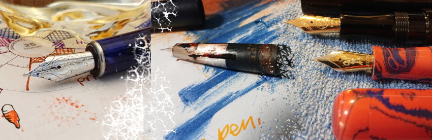
Nakaya pens are grail pens for a large number of pen addicts. They are handmade from ebonite (hard rubber) and hand coated with Japanese wakashi urushi lacquer. This gives them a rich look that other pen makers have a hard time duplicating. (More on that later.)
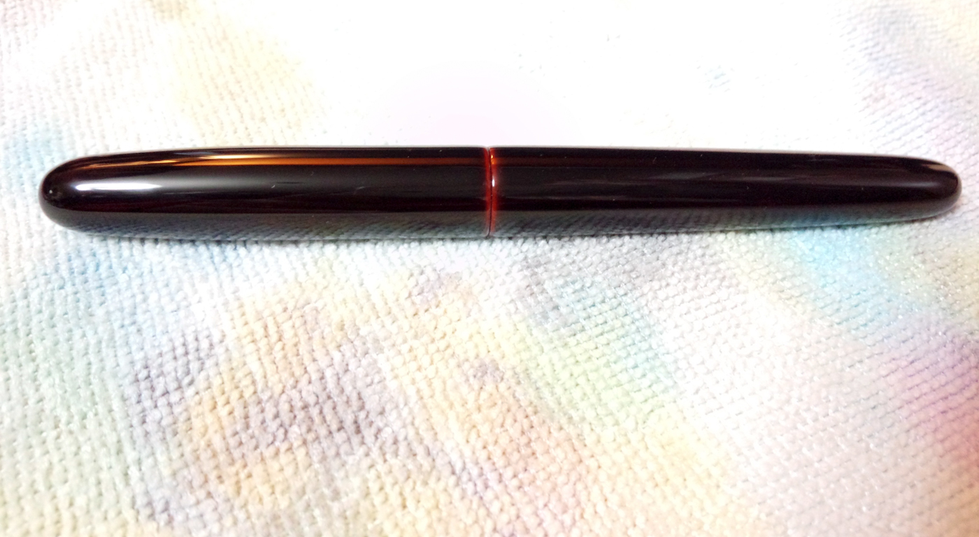
Mine is a Cigar Portable Kuro-Tamenuri (Black “pool” lacquering process, which doesn’t sound that sexy). Despite the name, it looks mostly black, except for areas where the months of coating and polishing revealed the red urushi layers.
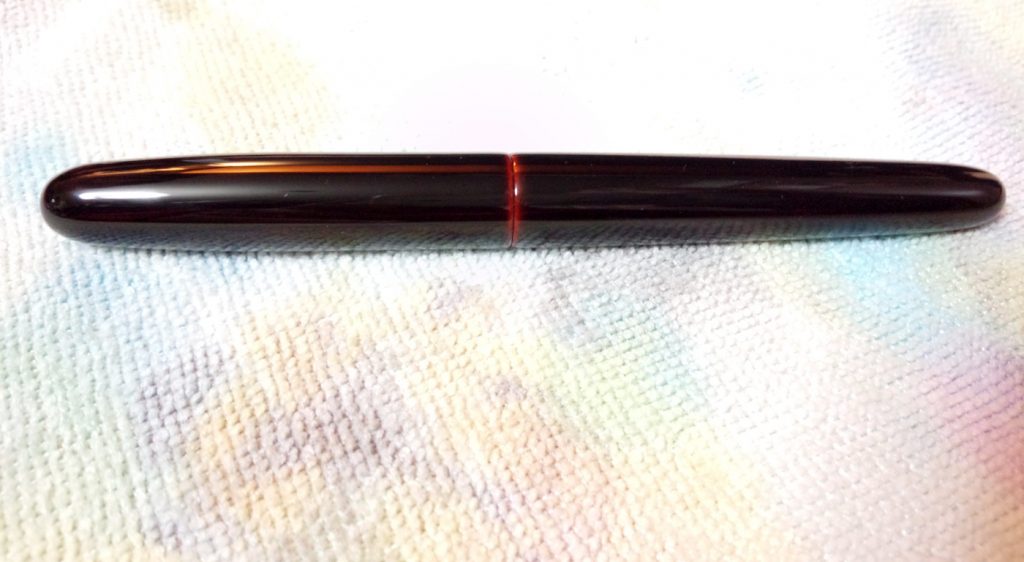
The capped pen. You can see the red layers where the cap meets the barrel.
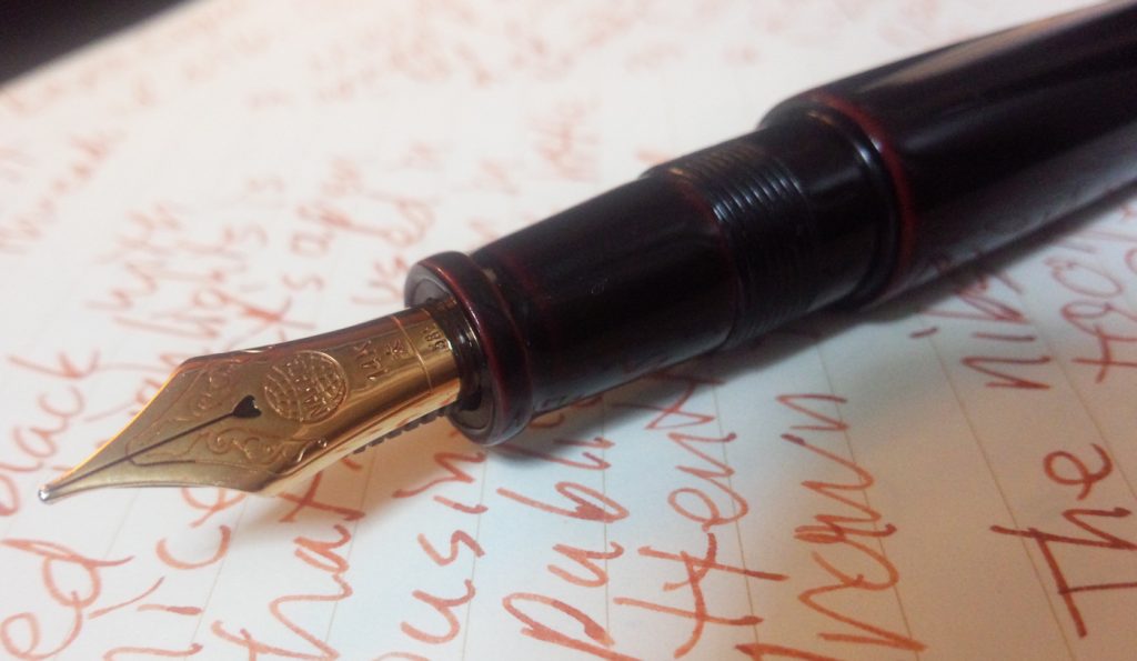
Another view, with more red layers exposed.
It wasn’t my first color choice for my grail pen, but I’ve learned to like the predominantly black look because it’s a pen that can be used in business or or in public with out attracting much attention, except from fellow pen addicts.
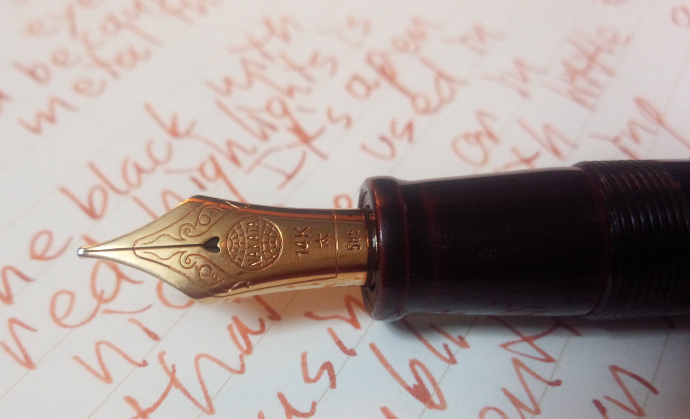
It has a 14K gold broad nib that has a nice bit of flex to it, although I have to be careful not to spring it. It is 150 mm long without the cap and 165 long with the cap. Like all Platinum based nibs, it has a lot tooth. One reviewer described the feeling as how a pencil feels and sounds as it moves across paper. At 20 grams, the pen is surprisingly light, even when inked.

Detail of the nib. (Yes, it says, “Nakata” not Nakaya, after the founder of the company.)
Because I bought it used, the nib still had the influence of the former owner. I took it to the Nakaya staff at a pen show and they fixed the nib (and replaced the feed) free of charge.
The only things that annoy me about the pen are that, because it has internal metal threads it can’t be used eye-dropper style and that, because it is a cartridge/converter pen, it doesn’t have a great ink capacity. This latter complaint is the deal breaker for a great many pen addicts. For the same money, I can get different pens with more ink capacity.
Also, because the version I got has no clip, it has to be placed carefully or it will roll off the table.
That said, there is something about the look and feel of a Nakaya that can’t be matched by other pens. They feel warm when you pick them up.
I understand why some people don’t like them, or more accurately, don’t prefer them. but it all works for me.