For some reason, this song seems appropriate:
The Fall 2016 Field Notes Limited Edition looked really cool, then I started using it and things changed slightly. I liked the paper, but the gimmick is annoying, at least on the one I used.
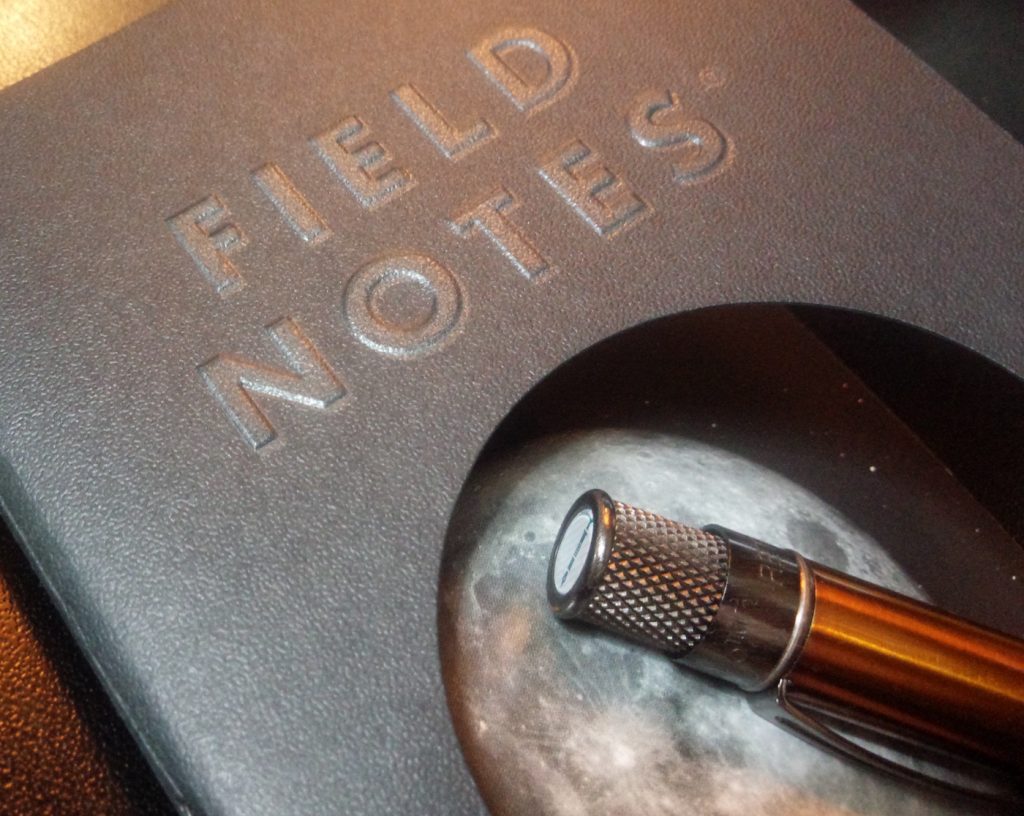
The Lunacy, released about the time of the harvest moon, is a moon themed edition. The unique feature is covers cut in ways to reveal different phases of the moon. The three-packs available to the public contain the full moon, last quarter, and crescent moon. Subscribers received a fourth, uncut version representing the “new moon”.
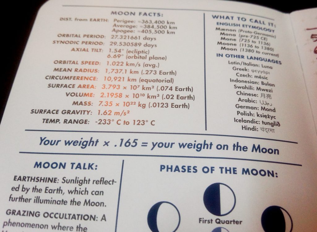
The covers look great, and have an interesting texture, but I found that with the full moon, as I flipped through the pages, my finger slipped through where I usually press. Or, it would flip at first but then the cover would bend and it would slap closed. It’s not a big deal, but it disrupts what should be simple process. I also don’t like the glossy end pages, even though they are necessary to pull off the gimmick and provide lots of interesting information. I’d rather have more pages I can use.

Detail of the cover showing the nice texture and the hole for the moon. (Also a Pen Addict Edition Retro 51 Rollerball.)

Some of the information. I would be 14.85 kg (32.73 lbs) on the moon and would rather have extra page.
I like the embossed dark side of the moon on the back and would rather have seen the full, half and crescent moon done that way on the front.
I used it as my mini-planner for a couple months. The 60# paper was excellent and handled every pen well and almost every ink. (Wancher Matcha is the heart breaker. It breaks hearts.) I liked the gray reticle dot pattern, even though I generally prefer blank pages. The paper has a gray wash to it that I was worried about at first, but it didn’t cause any problems except to my eyes when they tried to adjust to what they were seeing.
I wouldn’t mind getting more copies, but I’d probably give away the full moon version and since my favorite, the new moon, isn’t available, I’m not sure getting only two notebooks for the price would be worth it.
