A Field Notes subscription has phases. If you’re lucky, the only phase is “that’s awesome!” joy.
However, many times a year the phases are shockingly similar to dealing with death. First there’s the denial and the assumption that some clever troll with epic Photoshop skills is playing a joke because Field Notes would never produce such a horrid thing. Then there’s the anger that Field Notes would produce such a horrid thing, which leads to a sense of betrayal: “How could they put out a format that doesn’t fit in my leather cover?” Then, there’s a denial phase where you vow to never renew your subscription again once you get your last special edition even though you know you will totally renew your subscription.
Then there’s acceptance because, in my experience, you can also count on liking the horrid thing more than you thought you would.
When I first saw the details of the Field Notes Byline edition, all I could think of were reasons to hate it. When I got it in hand, those reasons didn’t change much:
–It’s spiral bound.
–It doesn’t fit in a shirt pocket. (Well, it does, but it pokes you in the neck.)
–It doesn’t fit in trousers pockets. (Well, it does, but it sticks out and catches on chairs when you stand.)
–It doesn’t fit my leather notebook cover.
–It has a strange format inspired by the mainstream media that proved so useless in the last election.

The Byline compared to a standard sized Workshop Companion.
Once I started using the Byline, though, I started liking it more than I thought I would, but I could also see its limitations.
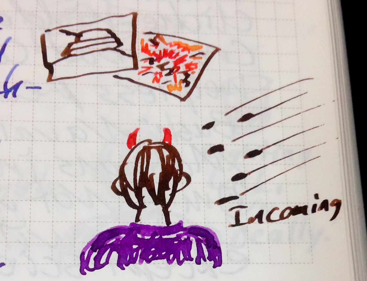
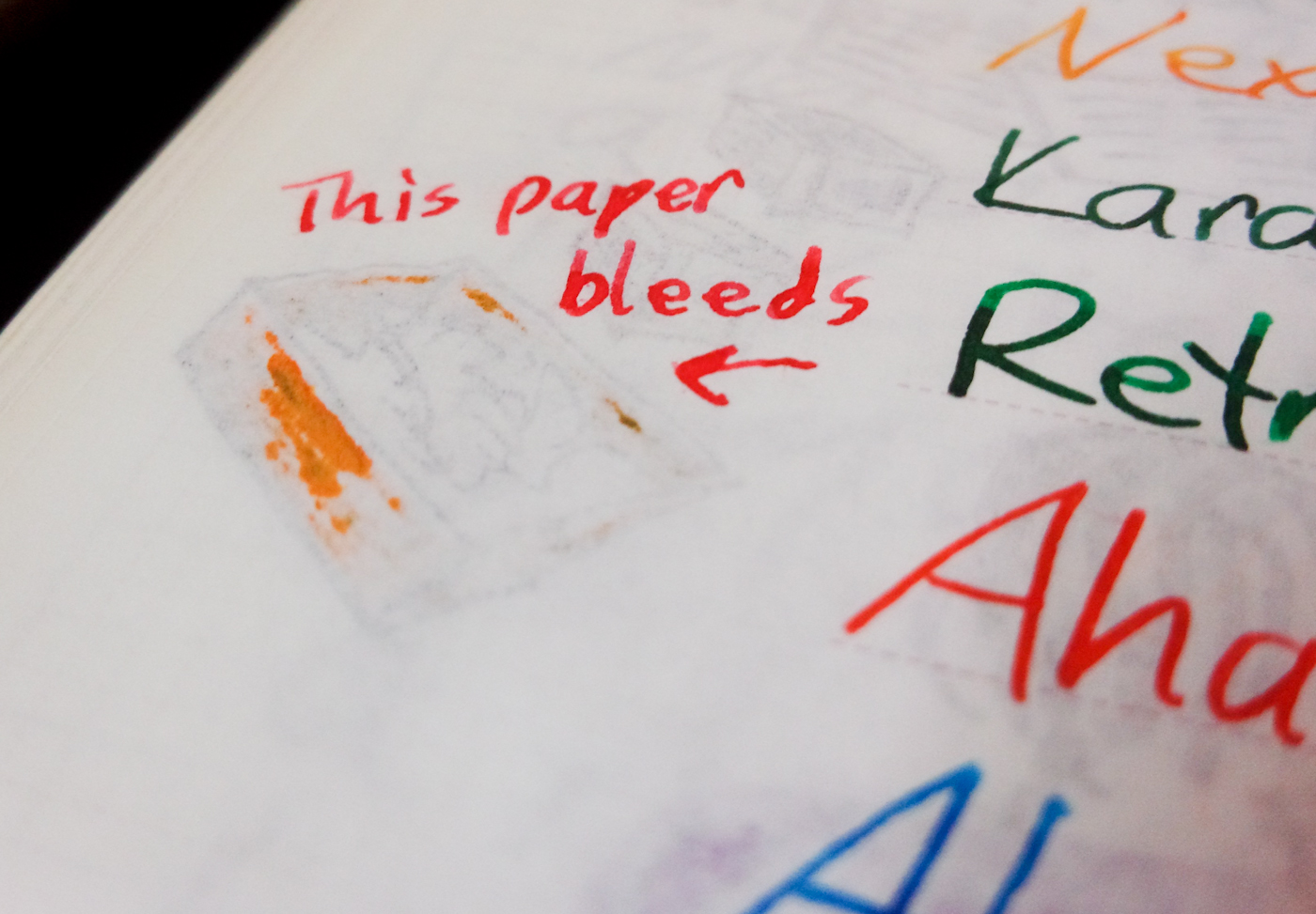
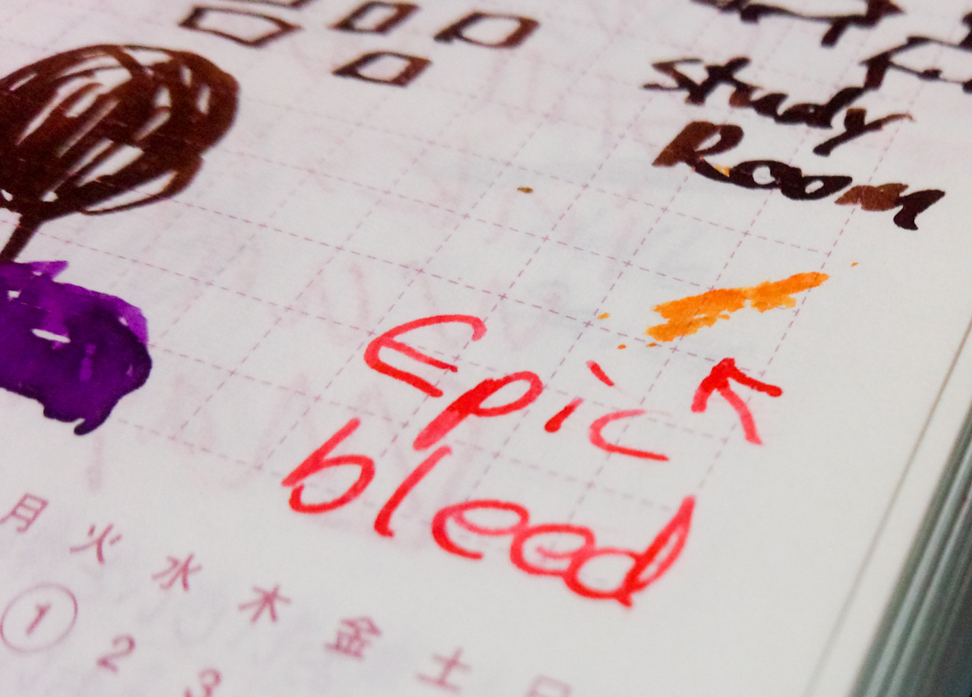
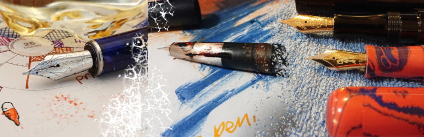
The paper (Cougar Natural 70# vellum) is very good, although an acquaintance makes a good argument against it. It doesn’t feather and it’s handled all my pens well and most of the inks. (Wancher Matcha is a heart breaker. It breaks hearts.)
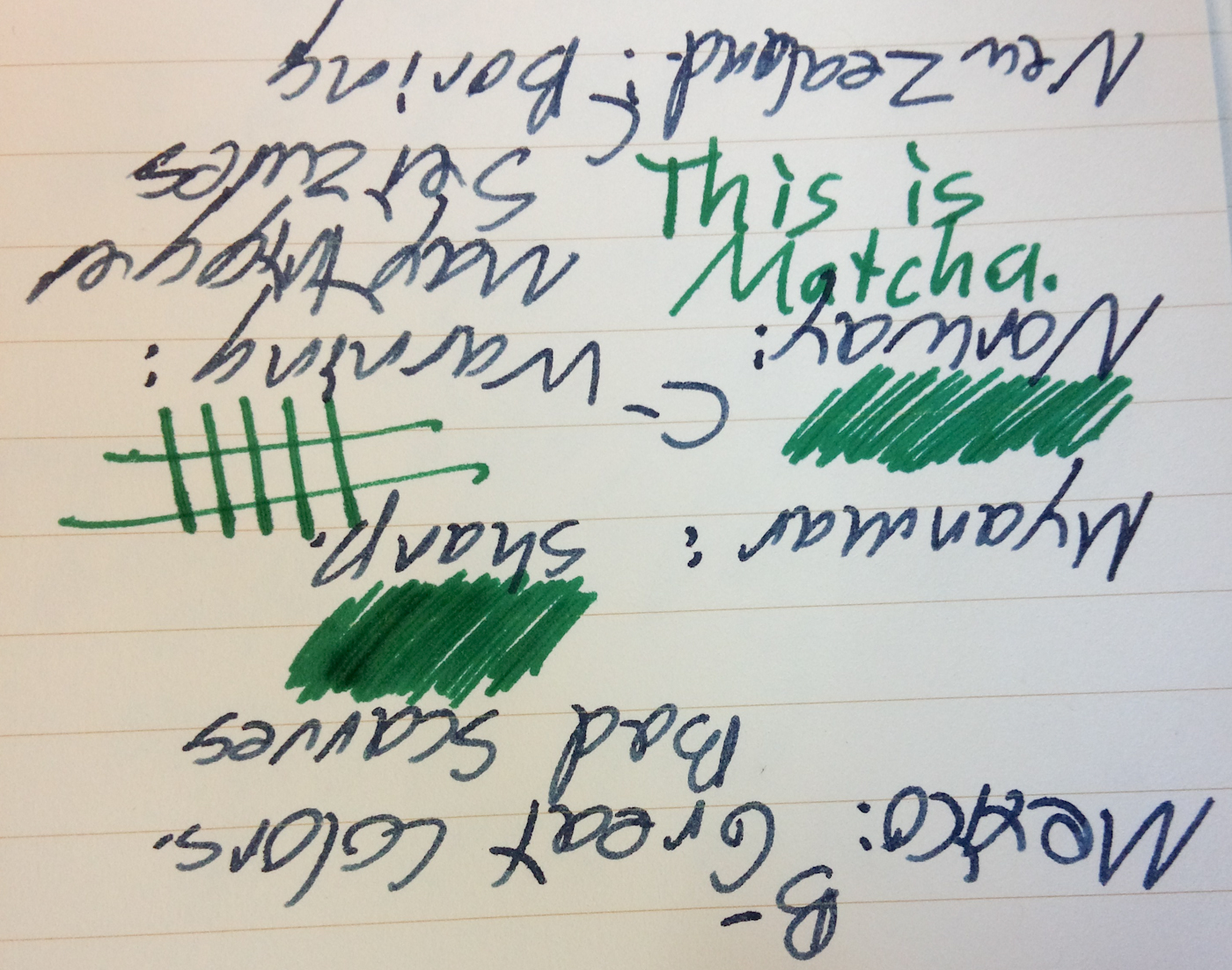
Wancher Matcha (the green ink) and a blue ink. (I can’t remember which flavor.) No, really, the picture is right-side up.

The other side of the above. You can see how Matcha bleeds through and breaks hearts.
When I made my Rio Olympics review, I thought it would be a good chance to finally use the Byline. For the most part, it’s easy to hold and the flip top works well when you’re taking a lot of notes. The only complaint I have, as with all flip-top notebooks, is that it’s hard to find things once you’ve got a lot of notes on a lot of pages. Even if you number them, you still have to pages around and the notebook back and forth to find what you’re looking for.
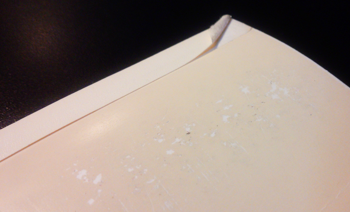
I like the pocket inside the cover and I like that the cover almost protects the spiral binding. Despite my attempts to be extra careful with the notebook, the spiral still managed to bend.
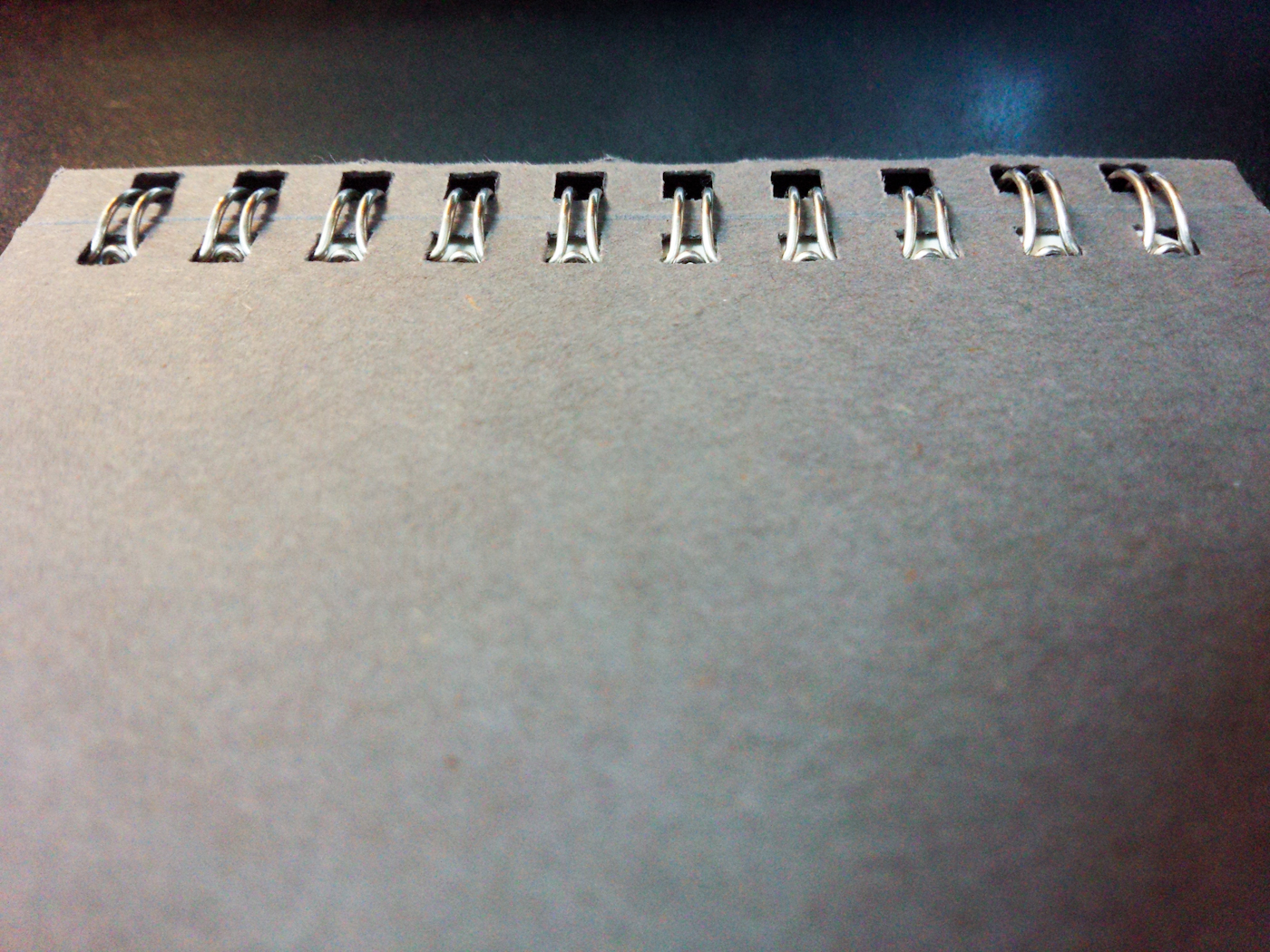
The spiral to the right is is messed up. It’s not bad, but it changes the way the cover and pages flip.
I still have one more book from the one package I’ve opened and I will definitely put it to use eventually. Because of the size, though, it will remain on my desk at home for random writing notes and random pen and ink tests. I’m not sure if I’ll ever use the other pack or just try to sell it to someone who likes them better.
The Byline, except through quarterly subscription is currently sold out. However, it was popular enough that Field Notes modified it as the Front Page and made it a permanent part of the store.