Note: The Monteverde Impressa receiving initial impressions today was kindly donated by Pen Chalet. It’s arrival in Japan prompted the following conversation with She Who Must Be Obeyed:
SWMBO–Here’s your package. What is it?
Me–It’s a fountain pen! (Ode to Joy plays from out of nowhere.)
SWMBO–How much money did it cost?
Me–Nothing! (Ta-Da! sound.) It was donated by Pen Chalet. It only cost me my soul.
SWMBO–Good. As long it wasn’t charged to our credit card.
Something like that.
The Monteverde Impressa (Pearl Silver with Blue Trim) I received today is the first Monteverde pen I’ve ever tried. I’ve only used it for a few hours, but I already like it.
It’s not the style of pen I’d choose for myself, especially because I’m still coming to terms with the square cap on the round body, but the the pearl silver looks great and hides finger prints well. I also like the metallic, cobalt blue furniture.
There were some odd issues when I tried to fill it the first time–I usually fill with the nib and converter attached–but that may be a testament to Sailor’s crappy new ink bottles rather than than the pen itself. In the end had to fill the converter and then attach it to the feed.
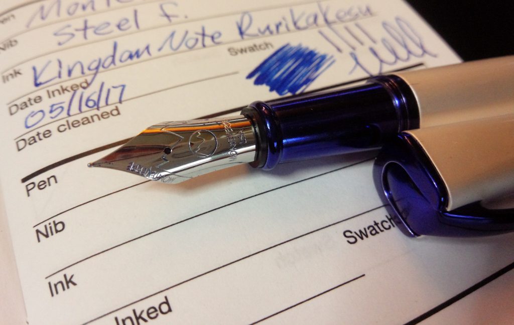
The steel F nib is smooth with a bit of tooth. At 42 grams (1.5 ounces) it is a rather heavy pen, especially when posted, but it’s still comfortable to use. Unposted, it’s as long as my TWSBI Diamond 580, but a portion of that is the larger nib which make the body and section shorter.
The section is 9 mm wide, which puts it right at the edge of too thin for my taste, but I like the ridge around the bottom of the section. It provides a bit of girth and keeps my fingers from gripping the nib.
Although it is a metal pen covered in some sort of enamel paint, it doesn’t feel cold or slippery.

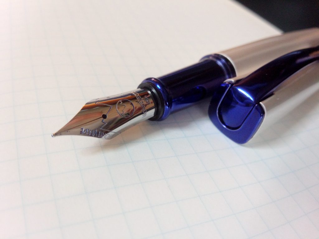
Detail of the nib and feed, next a small writing sample on an Inky Fingers Currently Inked notebook.
My only issues at this point are aesthetic. Although the nib writes well, I’m not sure it needs “MONTEVERDE” printed twice on it. Also, the pearl silver finish has a couple marks that look like scratches, but may actually be flaws in the finish.
Then there’s that square cap. (More on that and the overall look in a future review.)
The hinged clip is terrific, but I’m not sure about the metal screw I can see inside the cap. Since fountain pens tend to leak into the cap in some form or another, I’m worried about corrosion.
The pen seems to be targeted at people interested in trying a fountain pen for the first time and I was pleased to see it came with a converter as well as two small international cartridges. This allows the new user to try the pen and then move on to bottled ink/inky fingers without having to buy more stuff for the pen. The box it came with was also impressive, but seems to be overkill for a $27 pen. I say get rid of the box and make it a sub $25 pen.
The Impressa is now in my rotation and I’ll do a long term review in six months or so. Until then, thanks again to Pen Chalet for their generous donation.


Pingback: Monteverde Impressa–Long Term Review | Mere Blather