Category Archives: Pens

Karas Kustoms Brass Bolt–Heavy, Man. Heavy.

When all is said and done, writing with a pen and weightlifting ought not have too much in common.

A while ago, probably thanks to Massdrop, I bought a pen that looks awesome but is too heavy to use comfortably.

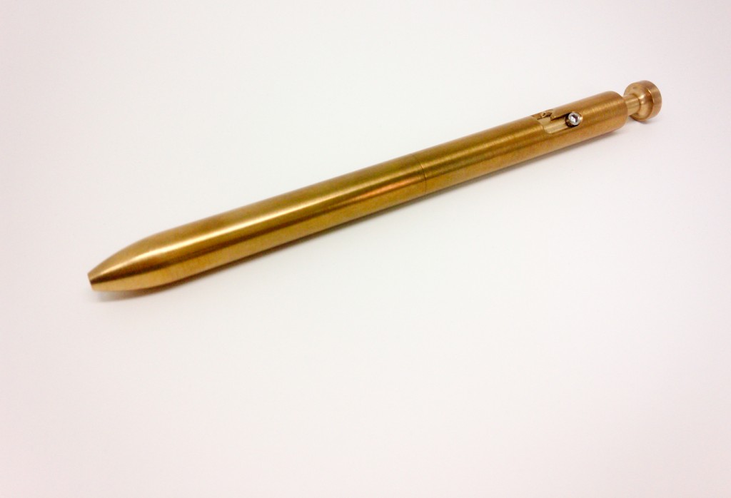
The pen is the brass version of the Karas Kustoms Bolt. The Brass Bolt (as I like to call it) looks a lot like an old school syringe. It is made of machined brass and holds a Pilot G2 refill–in this case a black .38. Like all Karas Kustoms pens it is well designed and perfectly machined. The worst I can say about the looks is that I can see the line where the two sections join.

This is a pen, not a syringe.

This is the Karas Kustoms Brass Bolt not a syringe. You can see the joining line in the middle. 

Rather than simply pressing the nock on the pen to deploy the tip, you have to press and twist. This, in theory, prevents the pen from deploying in your pocket or your bag and thus making a mess. Unfortunately, it also adds an inch or so (2-3 centimeters) to the length of the pen and throws off its balance.

I’ve written several sets of morning pages and my daily 10 ideas and each time I’ve found the pen awkward to use. The brass makes it 2.85 ounces (81 grams) which means it weighs more than my both my Tactile Turn Mover and Shaker pens combined (they are 2.4 ounces or 69 grams.) It also weighs almost as much as my Karas Kustoms Ink fountain pen and roller ball with the caps posted (3.6 ounces or 102 grams).

(Note: I never use them posted.)

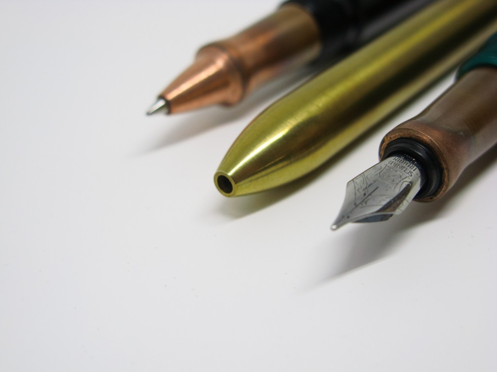
The Ink Roller ball (top); the Bolt (middle) and the Ink fountain pen (bottom). All the weight is in the middle.

The Ink Roller ball (top); the Brass Bolt (middle) and the Ink fountain pen (bottom). All the weight is in the middle.

Because the Brass Bolt is so long and heavy I find I have to choke back on the pen. If you look at the picture above, I have to grip the Bolt next to the threads on the other two pens in order to get it to balance right. I also find that extended writing makes my hand and wrist sore. It’s also a thick pen, which changes my grip.

Once again, all the weight is in the middle.

Once again, all the weight is in the middle.

Also, although the bolt mechanism is an interesting conversation piece, it seems to solve a problem that isn’t that much of a problem. In all the years I’ve used and carried ball point pens–which, yes, I still often do–I never once had one deploy in my pocket. In fact, the only mess that ever came from a ballpoint pen is when I accidentally stuck one back in my jeans pocket without un-nocking it. (It left an interesting star pattern on my jeans and my leg.)

Although it’s a beautiful pen, and I wish I liked it more, the brass Bolt is not long for my collection. If I’m not comfortable using it, I won’t keep it. I’ve heard that the aluminum versions are much lighter and much more comfortable to use. I may try one of them some day and do a little more writing and a lot less weight lifting.



There’s No Accounting For Taste in Office Pens

The school where I work has always been very good at providing good pens for the staff to use. The pens they provide are so good there’s now an “I took X” sheet we are expected to fill out every time we take a pen.

My dilemma, of course, is “do I take two pens but only sign for one?” Luckily for my conscience, I don’t use the kinds of pens they provide. (In other words, we’ll never know what I would do.)

The pens cover all the categories from waterproof pigment pens to gel pens to ordinary ball point pens.

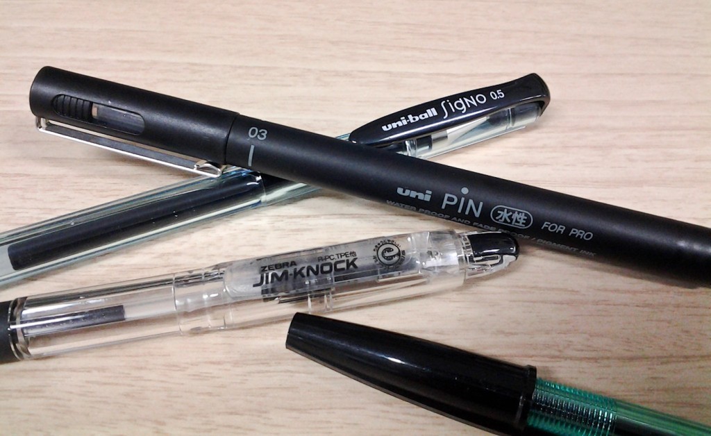
The black pens. Uni-Ball Signo UM-100; Uni PIN water proof; Zebra Jim-Knock; Zebra N-5000.

The black pens. Uni-Ball Signo UM-100; Uni PIN water proof pigment pen; Zebra Jim-Knock; Zebra N-5000.

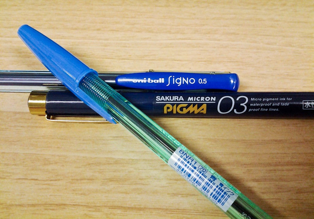
The blue pens: Uni-Ball Signo UM-100; Sakura Pigma Micron 03; Zebra N-5000.

The blue pens: Uni-Ball Signo UM-100; Sakura Pigma Micron 03; Zebra N-5000. The Sakura is very tempting…

Before I went full pentard with fountain pens, the pens I used to mark exams were either a red Signo UM-100 or a UNI PIN water proof (an older version).

The main requirements for a marking pen are: thick line that doesn’t bleed through on to other papers; good ink supply; a tip that doesn’t suddenly go dry; and a tip that doesn’t jam up as you mark harder in harder in increasing frustration. (The UNI PIN were especially bad at the latter test.) The problems were that over time the Signo built up gunk around the tip and needed to be wiped off and the marker-style tip of the UNI eventually wore down or got smashed in frustration.

I eventually moved to a red Pilot Vanishing Point filled with Pilot Red Ink for marking. It was comfortable to hold and had a decent ink supply. Although the ink supply wasn’t as good as a ballpoint or a gel ink pen, stopping to refill ink every now and then forced me to take a break and gave me a chance to find some whisky. (The timing of whisky to exam marking will be dealt with in another post.)

This year I’ll be marking my exams with a TWSBI Mini loaded with purple ink. There’s no particular reason for this other than 1) purple is one of the school’s colors; 2) it’s an excuse to use the pen more and 3) I’m interested in seeing the psychological effects of the purple ink on the students; and 4) I’m always looking for ways to use up my ink supply.


Uni Style Fit Single Color Slim Gel Ink Pen–Small Pen Big Name

The other day I found a pen that I don’t fully understand. It has a name that’s too long in any language.

In Japan it’s the Style Fit Single Color Holder  (スタイルフィット 単色ホルダー) but in English it’s the Uni Style Fit Single Color Slim Gel Ink Pen. In either language, it seems to be a single ink version of the Uni Style Fit Multi Pen that holds either three ink refills or five.

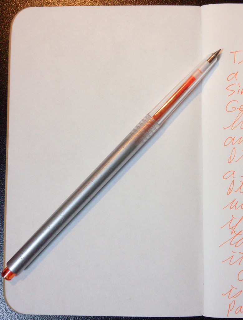
The version I found has a 0.28 mm tip and orange ink. It is silver with a clear section and an orange nock.

I used the Style Fit for a few batches of morning pages and for my daily 10 Ideas. It writes smoothly, and I found the .28 mm line growing on me. It wasn’t scratchy, even on copy paper, but the pen is too slender for me to hold comfortably. It’s thinner than a wood-case pencil.

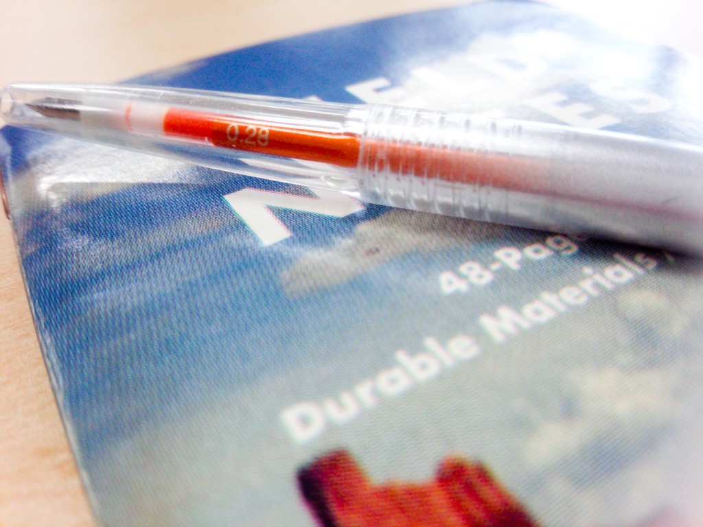
The clear section on the Uni Style Fit Holder.

The clear section on the Uni Style Fit Holder.

I also found the orange ink to be too bright for my taste. That said, it would make an excellent way to highlight text whilst taking notes in a meeting or a class. The pen was also thin enough to fit inside the cover of a Midori Traveler’s Notebook, although it would require some modifications to make it stay in place securely.

What I don’t understand is the exact purpose of this pen. (And, yes, I am the kind of guy who ponders a pen’s purpose in life.) The refill can be pulled out and placed in a multi pen, making the pen a kind of active refill storage device. It’s like a way to use your refill if you have six inks but only five places in your multi pen. It’s also a way to write if you are too lazy to actually change out an empty refill.

I’m glad I found it and got a chance to play with it, but I doubt I’ll be buying one for myself. Instead, I’ll be returning this one to the room from whence it came.

A full length shot of the Style Fit on a Field Notes notebook. You see traces of the line off to the right.

A full length shot of the Style Fit on a Field Notes notebook. You see traces of the line off to the right.

You Don’t Know What You Got ‘Til You List It

Periodically, when I have lots of stuff to do, I avoid it by decluttering and purging a bunch of stuff.

(Note: I used to bake cookies as a form of avoidance, but it’s too warm for that and the butter required is suddenly a rare and precious thing here in Japan.)

(Note: The cookies were awesome and usually handed out to fellow graduate students, but that was another post.)

Part of my decluttering process involves sitting down and listing stuff. I started with pens and fountain pens and was shocked to see how many I actually have (23) and that doesn’t include the two on the way (well, at least one; the other is confusing. Long story).

Of those 23, seven are already retired and at least four of those have enough value to be sold. A few others just aren’t interesting enough to use or keep (which is part of the purge). One of my tests is to clean up a pen and put it away for a while and see if I miss it. If I don’t, it’s a candidate for the purge.

After that, I sat down and listed the bottles of ink I’ve acquired. That was even more shocking: 14 types in 16 bottles–also a long story. One of those bottles, despite my best efforts to like it, is crap. Two of the others just aren’t interesting enough to use or to keep. Some of them I’ve had for a long time and the bottles are half empty but I’ve counted them anyway.

Don’t even get me started about knives and notebooks.

Part of what happens is the acquisitions happen over time. A pen here; a bottle of ink there; both at the same time back over yonder. Inevitably, old purchases get put away and replaced but by new ones but rarely are all the purchases in the same place at the same time. Putting them in one place, I’ve just discovered, is much better than sitting down and making a list. Not only will you be shocked by the pile of stuff but you will forget to add one or two things if you don’t actually look at them.

Even as I wrote this post I realized I’d forgotten to list three pens.

The other list I make is which of the listed items I use regularly and why. That’s down to a half a dozen  pens and six inks. I recently bought larger bottles of two inks I like a lot, which is why I have 14 inks in 16 bottles.

What inspires all this is my desk. I like it cleared off because moving stuff around becomes a kind of distraction, especially when it’s time to dust. (And especially, especially, as right now, when it’s WAY past time to dust.) Over time, though, the acquisitions, and a few delayed decisions and projects begin to pile up and take up space. I get annoyed by it and clean things up and move things out.

Then I start getting more stuff, mostly because I now have space for it. Sigh.


Name Stamps Last Longer Than Memories

I’ve mentioned before how I spent a year or so studying Japanese calligraphy and then stopped. Before I stopped, though, I acquired a few skills along with several brushes, paper, weights, felt pads, ink sticks and grind stones.

Most of that gear has either been thrown away, sold or, in the case of the brushes and the ink sticks, passed on to our girls. The only things I’ve kept are a couple seals.

In Asia, for lots of complicated reasons, the preferred method of sealing contracts and official forms is with a literal seal. The seals, known as “chops” in Chinese speaking countries, are called “Hanko” (判子) in Japan. (That’s “Han” as in “Han shot first” and “ko” as in “coke”.)

Every family, mine included, as an official seal for official documents as do most companies. (Actually, I suspect they all do.) The official seals are made by craftsmen and the hanko is officially recorded. As I understand it, every hanko is different, even those made for people with the same last names. Those are usually round and the coolest kids, depending on your point of view, have hanko made from ivory.

Mine are made from soap stone and are the more artistic versions. They were used to sign my calligraphy works (which are buried somewhere and unavailable for reproduction). Because I was in a “this is awesome” philosophical mood, I opted for kanji and then spent time working out a proper pretentious artist’s name.

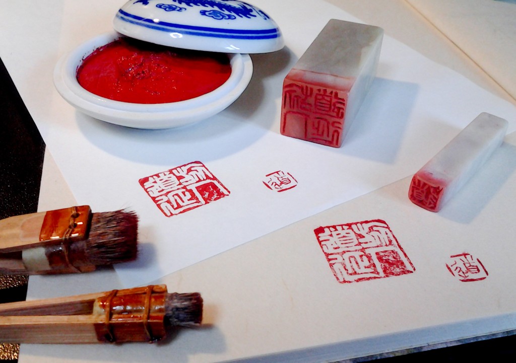
The two hanko, my cleaning brushes and the cinnabar paste next to the final results.

The two hanko and paraphernalia next to the results on Tomoe River paper (top) and Japanese washi (bottom).

The larger version reads  旅人道延, or Tabibito Doen (the latter word is two syllables and pronounced very close to Dwayne). The high concept, which made sense at the time, was that since I was travelling, I’d use the kanji for traveler (旅人) and the letters for road/path (道) and stretches (延). Thus, the traveler’s road stretches (with an implied “into the future”.) This hanko was used on larger works (the paper was about a meter long).

The small version is only the letter “do” (pronounced “doe”) and was used on smaller works.

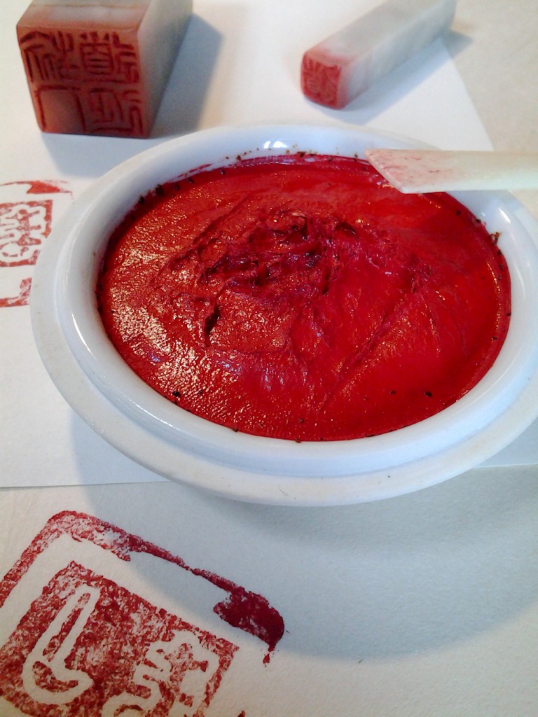
I don’t remember how much they cost, but I also acquired a couple cleaning brushes and a tub of cinnabar/vermilion paste which is a remarkable concoction of castor oil and vermilion powder and other ingredients that has stayed usable for over 18 years.

The cinnabar (or vermillion) paste with the ox bone smoothing spatula.

The cinnabar (or vermillion) paste with the ox bone smoothing spatula. Sharp eyes will notice a third stamp.

I was surprised, after a couple do-overs, that the placement of the seals was as important as the calligraphy itself. A perfect work could be ruined by a badly placed stamp or a smudged one.

I use them now to mark the backs of my notebooks. I could make the small one my official stamp, but that would involve paperwork.

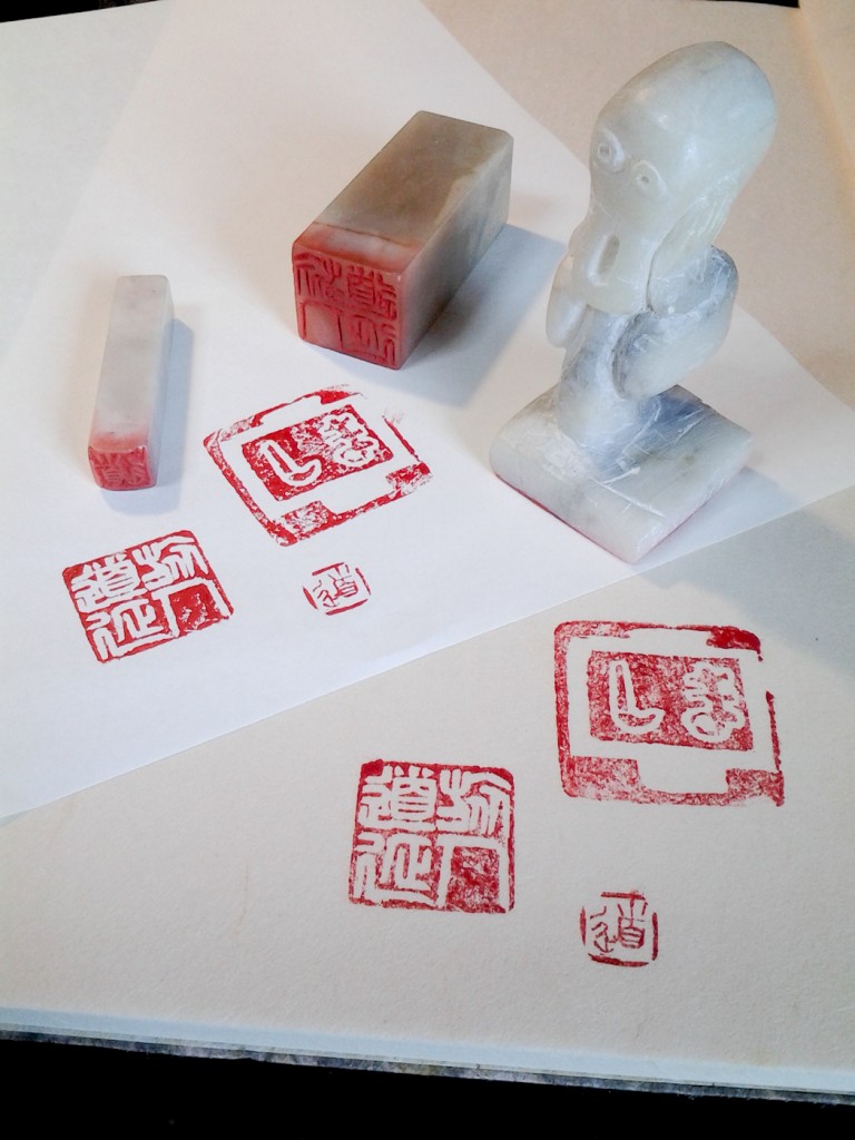
I also acquired, as a gift, a hanko hand made by a student. It has his name Nakashima (Naka) 中 and Shima (しま) with the Naka around the outside as a frame. I mostly keep it because he carved it to look like the man in Munch’s “The Scream”.

My three hanko and how they look on paper.

My three hanko and how they look on paper.

I’m tempted to have it recarved and turned into my official stamp, but it’s the only reason I remember the student’s name. Instead I’ll keep in on my desk as a way to express my mood.


(Note: If you’re interested in carving your own hanko, you can buy a kit here.)

(Note 2: hanko are also referred to as “inkan” (印鑑). I’ve not been able to tell if there’s a difference as they seem to be used interchangeably.)

Backpocket Journal (Tomoe River Edition)–Long Term Review

I don’t remember where I heard about Curnow Bookbinding and Leatherwork’s Backpocket Journals, but once I did, I ordered a few packs of their Tomoe River editions. That was the first problem.

Curnow seems to be a casually run business that generally only sells stuff that’s available (it apparently will take special orders, though) and does so through an oddly complicated process:

They announce what’s available.
You email them and tell them what you want.
They tell you the price including shipping.
You respond and agree to the price.
They send you a PayPal invoice.
You pay.
They send you notebooks.

It took a few extra steps, but they arrived with no problems.

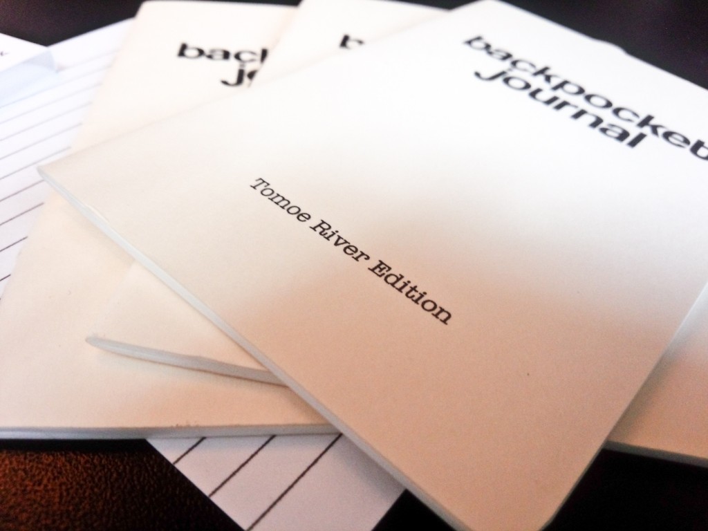
It took a few extra steps, but they arrived with no problems. Each order has three notebooks and a lined insert.

Once this process is over, you end up with three well made notebooks. Backpocket Journals are 3.5 inches (8.89 cm) by 5.25 inches (13.36 cm). This puts them halfway between a passport and a Field Notes notebook. The ones I ordered had rounded corners and cream card stock covers. They have sewn bindings that hold 48 pages of unlined fountain pen friendly Tomoe River paper).

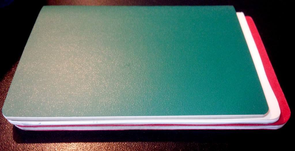
A Backpocket Journal sandwiched between a passport sized MUJI notebook and a Field Notes notebook.

A Backpocket Journal sandwiched between a passport sized MUJI notebook (top) and a Field Notes notebook (bottom).

The Tomoe River paper makes the notebook thinner and flimsier than a Field Notes notebook. At first I was unimpressed because, although they are gorgeous, the Backpockets feel too flimsy to last. The one I used, though, survived over a month in my pocket and my bag with few problems. The only visible signs of wear were some wrinkles, black scuff marks on the cream card stock paper and small tears around the holes for the binding thread. The thinness makes them well suited for backpockets as they conform to any shape back end.

Only perfectionist fountain pen users will dislike the paper. There is the typical ghosting that comes with Tomoe River paper, but only Noodler’s Apache Sunset managed to bleed through, although it didn’t mark the following page. Curnow includes a lined card to serve as backing. I personally never used this as it was just something else to carry, but it does provide a good book mark and adds just a touch of rigidity to the notebook when you’re writing without a hard surface.

I like them a lot and will add them to my rotation of notebooks (I’m using about one a month now) but I’m not sure I’ll get any more, especially as I already have a lot of pocket sized notebooks. I would like to try one of the regular edition Backpocket Journals to see how it holds up, but we’ll see.

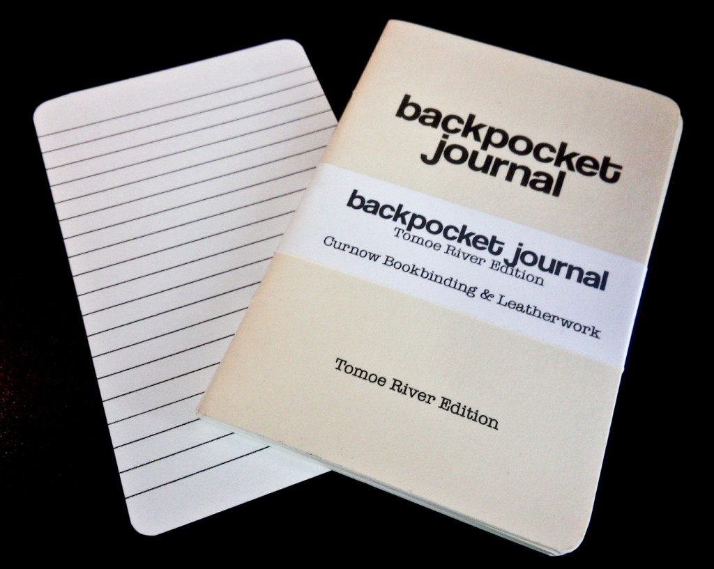
The notebooks fresh out of the post.

The notebooks fresh out of the post.


Vintage Things and the Dregs of Someone Else’s Past

Someone, I think it was Brad Dowdy the Pen Addict, said he wasn’t particularly interested in vintage pens because there were too many new pens worth having and they didn’t require any special care.

I recently bought a vintage Pilot Capless and although I like it, I’m beginning to come around to the Pen Addict’s point of view. Sort of. I think there are a couple problems with vintage pens.

First, it bothers me that something only a couple years older than I am is considered vintage.

Second, unless they’ve been cleaned carefully, they come with problems that most new pens don’t have. (There are exceptions, but more on those in another post.) In the case of my Pilot Capless I gave it a good water flush right after I bought it and then inked it up with Pilot Iroshizuku Murasaki-Shikubu, a purple ink that’s reasonably safe for using in any and all fountain pens.

At first I was impressed with the pen. It has a Fine nib which is smaller than I’m used to, but it wrote well. In fact, it worked great right up until the moment it didn’t. Half way through a set of morning pages it suddenly went dry. I emptied it out and soaked it in cleaning solution for several hours and then tried inking it again.

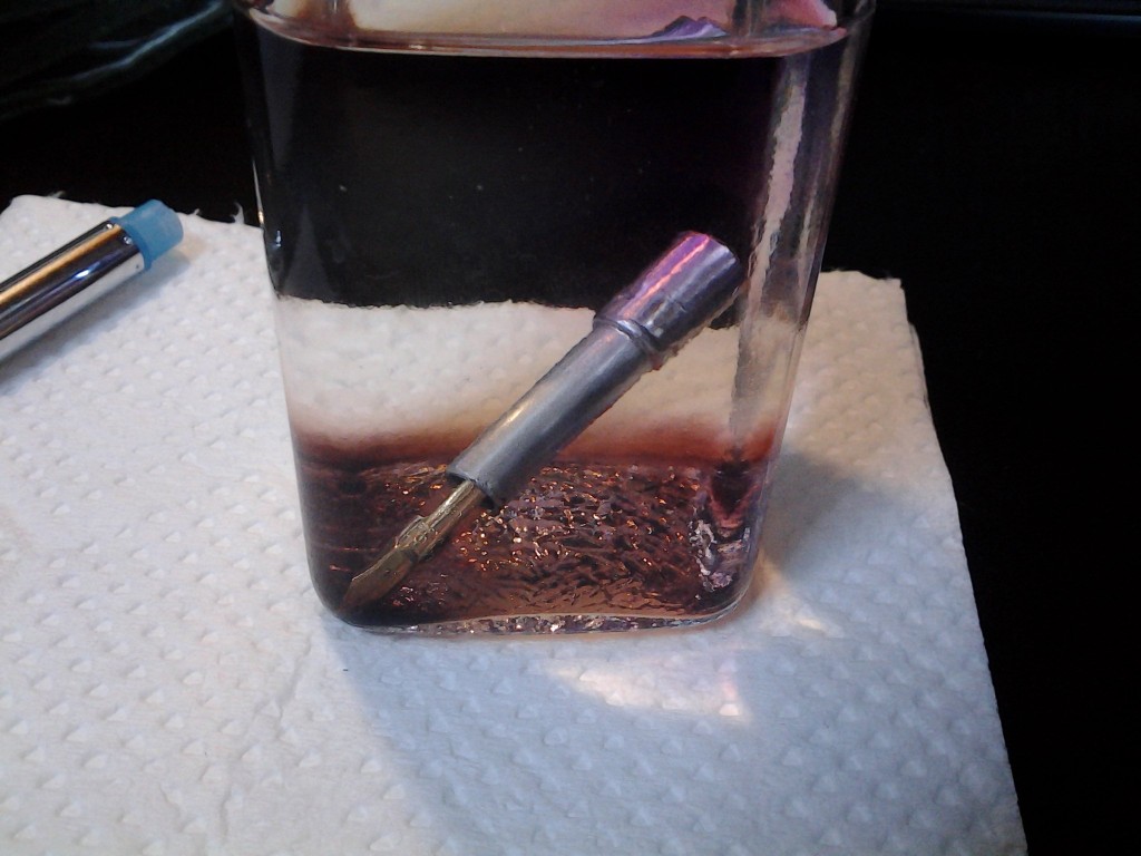
Once again, it worked well until it didn’t. I also noticed the purple ink had developed a noticeable blue-black tinge. This led to me cleaning it out again and letting it soak for 24 hours in cleaning solution. The results were kind of gross. By morning a layer of crud from past owners had formed in the bottom of the ink bottle I use as a cleaning glass.

This is gross but I've been told drinking it will give me super powers.

This is gross but I’ve been told drinking it will give me super powers.

Now, it’s been dried and inked and seems to be writing well. The blue-black tinge is gone and it has better flow.

We’ll find out for sure tomorrow, though, when I attempt morning pages with it. If it goes dry halfway through, there will be swearing.

This has led me to be more skeptical of buying vintage pens. That said, I may leave a not with Mr. Fujii at Euro Box to let me know if any more vintage capless pens appear in this store.


Morning Pages for Worse and for Better

Several months ago, as part of a plan to write more, I decided to try my hand at writing morning pages. I quickly modified them but I’m not sure if that was for the better.

For those who don’t know, “morning pages” are the brainchild of Julia Cameron from her book The Artist’s Way. To do morning pages you’re supposed to wake up, pick up a notebook and knock out three pages of writing without putting any thought, grammar or punctuation into it. (Rather like this blog, at times, now that I think about it.) The theory is that you’re essentially performing a kind of brain dump and cleansing your mind of whatever flows from your fingers and your pen. You then are supposed to throw away the completed notebook.

I tried the pages that way for a while but then eventually felt as if I was wasting time with them.  I’d zone out, nearly fall asleep, and long for coffee. Most of my early pages were along the lines of  “I need coffee I need coffee I need coffee I need coffee sweet mother of Jesus I need coffee coffee coffee coffee my kingdom for coffee my soul for coffee your soul for coffee death to all who refuse to bring me coffee no coffee no life no coffee no God decafen, decaffinated, decaf coffee is evil and freaking hard to spell.” (Something like that.) Basically, it was all the kinds of navel gazing that kept me from writing morning pages in the first place. (In fact, it’s the same thing that kept me from writing a blog for a long time and still keeps me from writing a proper diary.)

That lasted for about a tablet and a half. Since then I’ve modified my morning pages routine. I write on A4 copy paper pads I assembled myself from scrap paper and I don’t start writing until I’ve showered and had at least one sip of coffee. My goal is two A4 pages in half an hour, although I’ve been known to take longer on weekends and days I don’t have to be into work early.

I change pens every day so I have a chance to do long term tests of different pens, nibs and inks on cheap copy paper. I also write different types of pages. There are the whiny brain dumps where I complain about life in general; the pen reviews where I describe how it feels to write with the various pens; and the focused writing.

In the latter I focus on whatever particular project I happen to be working on. I sketch characters and scenes and brainstorm ideas for different plots and different characters. If anything seems particularly useful and legible, I underline it and then go back and type into a computer file. I’ve managed to get some useful stuff that way.

If I were smart, I’d brainstorm one of these blog entries and kill two birds with one stone, so to speak. But, if you’re a regular reader of this blog, you know I’m not that smart.


Pelikan 4001 Blue Black Ink–Banned for Good Reasons

Pelikan 4001 Blue Black ink is so bad I’m actually kind of hoping I somehow got a fake bottle of it.

The ink comes with a certain mystique as it has been banned in the USA for reasons involving a Chemical That Is Never Named (probably not its real name). For this reason everyone interested in fountain pens and blue black ink is trying to get a bottle. I’ve also read reviews praising it on many websites and thought I’d give it a try.

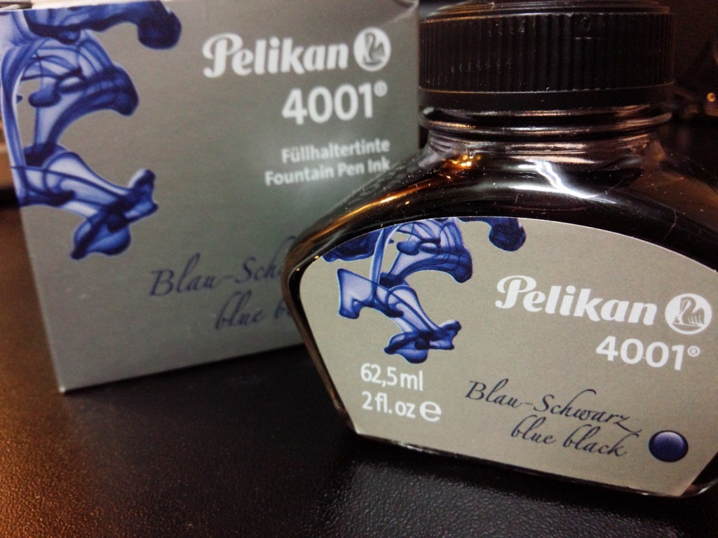
The box and the bottle. Neither can be trusted.

The box and the bottle. Neither can be trusted.

I started out using it in my aluminum Nexus Minimal with a steel M nib. As part of my pen and ink testing process I usually sit down and write two pages of morning pages. This lets me test the comfort of a pen and the flow and color of the ink on cheap copy paper. Later I try the pen and ink on a higher quality paper.

I was immediately struck by how poorly the ink flowed. It felt dry and it left a grey line that darkened a bit over time but still seemed very pale. I cleaned out the pen and made sure it was completely dry. I shook the bottle to mix the ink and tried inking the Nexus again.

I got the same result.

I thought it might be the nib, which needed to be adjusted, and decided to try it in a different pen. The next day inked up my Levenger Sunset, which is one of the juiciest pens I own.

The line was slightly darker but not much. Even with the gold nib on the Sunset I felt as if I was writing with a dying ballpoint pen. I had to resist the urge to press harder to make the ink flow and to refrain from breathing on the end to help the ink flow. In the way some inks change color as they dry and age, the ink does eventually darken but it never has that satisfying color from the label and that many reviews praise.

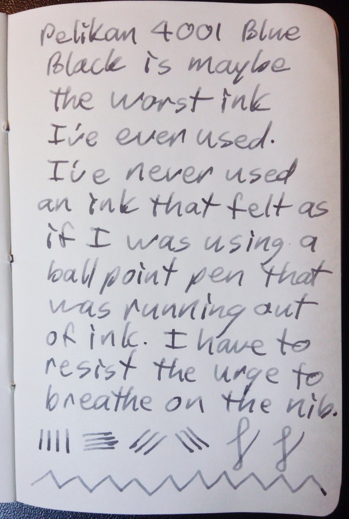
A sample on Tomoe River paper. You can see how pale it is.

A sample on Tomoe River paper. You can see how pale it is.

In the end, Pelikan 4001 Blue Black is a good example of what fountain pen types call a “dry ink”. It’s helpful when you’re confronted with the question “What do you mean that ink is dry?” (As if any normal person would ever ask that question.)

I left the ink in until the converter was used up and it’s officially been banned from my pen and rotation. Now I just have to find a place to store the bottle until I finally decide to throw it out or give it away.


Some Things are Classic, Some Things are Just Old, Some Old Things Are Classic

I went to Tokyo this afternoon to get nib work on two of my new pens. I ended up leaving with a pen that’s older than I am.

Although I like my Namisu Nexus Minimal fountain pens, both pens had nib issues. The Titanium nib was off center and the tines were misaligned. The steel nib was dry. I could have realigned the tines myself, but I had part of the day off and it was a good chance to get out of Dodge for a while.

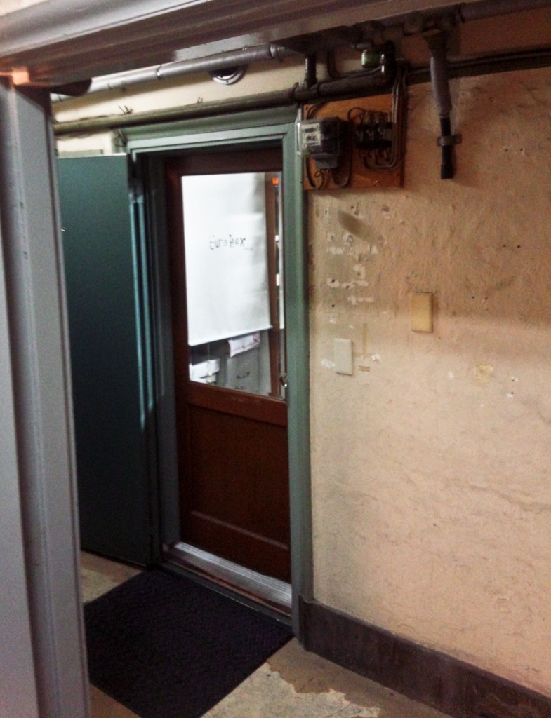
I decided to go to EuroBox (link in Japanese) which is a small vintage pen shop right at the end of the Ginza shopping district in downtown Tokyo. It is in one of the old creepy buildings I like a lot. The stair case to the 4th floor (3rd floor UK) is hard to find and it’s narrow, low and creepy. If you go up the main staircase, you won’t find EuroBox, just a dark hallway with lots of suspicious empty rooms. EuroBox, when you find it, is surrounded by peeled paint and exposed electrical boxes.

The door to Euro-Box. Come visit us, Dwayne. Come visit us forever and ever and ever...

The door to EuroBox. Come visit us, Dwayne. Come visit us forever and ever and ever…

When I arrived, the proprietor, Eizo Fujii was helping a customer. This gave me time to peruse the displays of vintage pens. (I didn’t take any pictures as there’s a sign asking you not to. Because he was busy, i didn’t get a chance to ask him for permission. You’ll just have to visit yourself.)

As I was looking, he returned a tray of pens to the display and I noticed they were vintage Pilot Capless pens. My ears went up and I took a look at a black one expecting the price to be absurd. When it wasn’t–it’s actually cheaper than a new Pilot Vanishing Point–I started the pen buyer’s rationalization process: I expected that to be a lot more expensive than that therefore, at that price, that’s like getting a discount on it. That’s totally a bargain! I’ll take that but only because I’m saving money on that.

(Note: by that logic, almost anything, even a private jet with gold toilet fixtures, can be considered a bargain.)

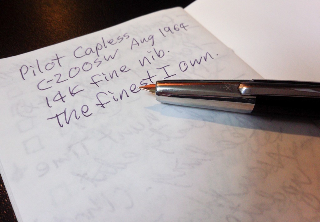
When it was my turn, Mr. Fujii, who speaks very good English, fixed my Nexus pens as I watched. After he finished I asked to try to the Pilot Capless C200SW (manufactured August 1964 I believe). Unfortunately, I liked it enough I decided to buy it.

I then had to go down to Ito-Ya, one of the best stationers in Japan, to get a converter that fit the pen. (The cartridges it takes are no longer made.) After I got the pen home I had to soak it to clean out quite a bit of gunk, but now it works fine.

The initial impressions are good: It is slender but unlike other Capless pens, the clip helps you rather than gets in your way. I suspect lefties would have little trouble using this pen, which is not always true of vanishing point pens. It’s also a touch longer than my similar Vanishing Points.

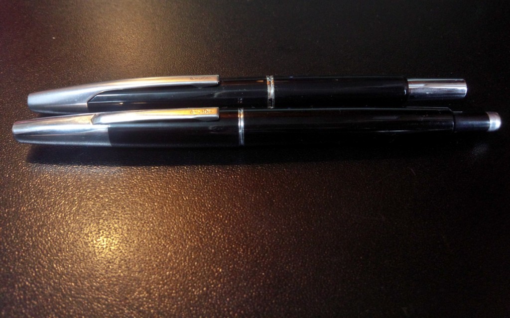
The 1964 Capless compared with my mid-90's Vanishing Point.

The 1964 Capless compared with my mid-90’s Vanishing Point.

The nock mechanism is odd. You have to push it half way to extend the nib, then push it the rest of the way to release it. If you just push it all the way it doesn’t stay open and Mr. Fujii looks at you in a sad way as if you are an idiot (well, maybe that’s just me.) It has a Fine nib which I usually don’t like but Mr. Fujii smoothed it perfectly.

The pen with the nib extended and a brief writing sample.

The pen with the nib extended and a brief writing sample explaining some of the pen’s details.

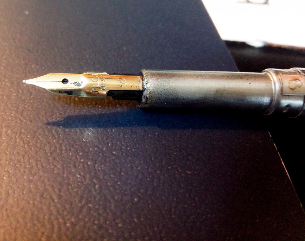
The nib section, pre-cleaning. I like the odd facets on the nib.

The nib section, pre-cleaning. I like the odd facets on the nib.

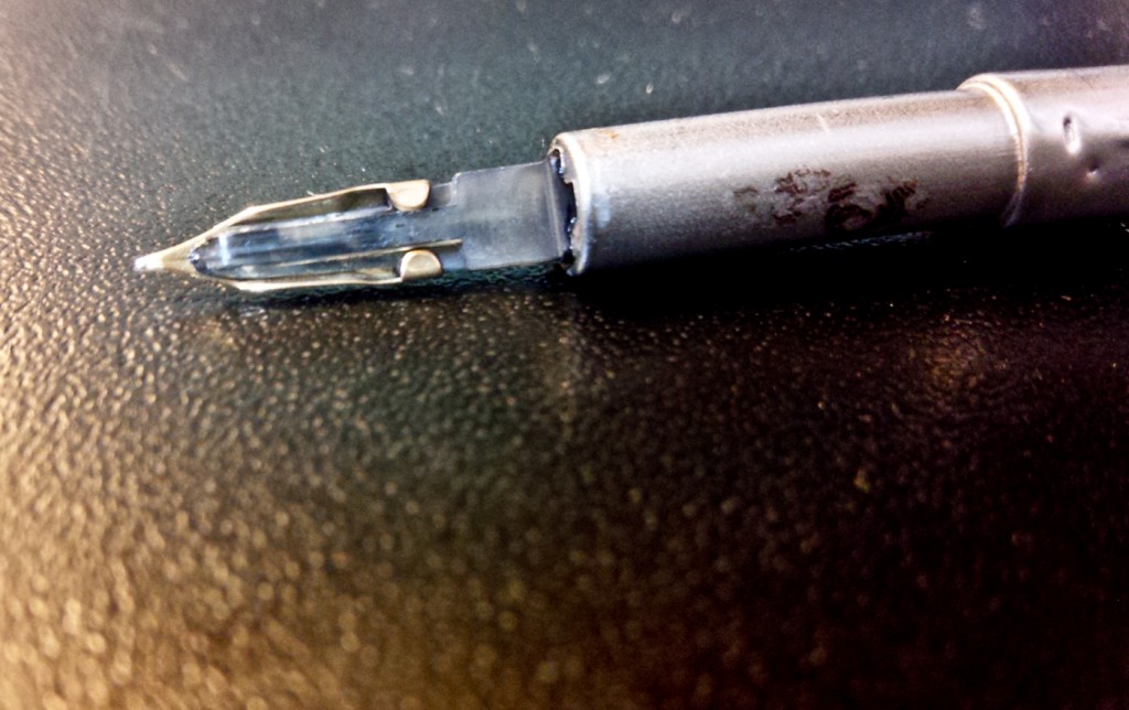
The underside of the nib. You can see the surprisingly cool clear feed.

The underside of the nib. You can see the surprisingly cool clear feed.

I’ll put it in my pen rotation and do a long term review another day. Until then, there was a pink one She Who Must Be Obeyed might like. And a red and gold one other people might like. At that price they are real bargains…