Tag Archives: fountain pen

The 18th Mitsukoshi Fountain Pen Festival

It was the food that made me mad and that probably jaded my reaction to today. Well, that and the long wait.

To understand what’s wrong with the Mitsukoshi Fountain Pen Festival (and the Maruzen version, for that matter) you have to imagine the oldest, most prestigious department store in your town or city holding an annual festival featuring socks.

The store invites a few makers who demonstrate different techniques for making socks, and who will fix your worn out socks if you’re lucky enough to get an appointment, they may even offer a Sock Festival exclusive pair of socks, but mostly what’s being sold is stock from the store and it’s being sold by the clerks who sell it every day. They can recite materials and manufacturing techniques and statistics and even let you handle some of the material but they do so without passion. They have a product, they sell it, but it’s no more important to the store than the food being sold nearby or the fine China on the other side of the festival space.

Today, to get to the Fountain Pen Festival, I had to walk through a large food event that brought dozens and dozens of noisy people. The food displays ended right across the walking path from the fountain pen festival but the noise traveled quite far. During a special fountain pen art display, and short speech by the head of Pelikan Japan, the speakers had to use microphones to speak to the dozen or so people gathered to participate or listen whilst behind the audience food salesman hawked their wares.

And, of course, pictures were not allowed.

Despite this, I set out to have a good time, and tried to crash the Sailor pen experts repair line to get my Nagasawa Profit’s nib straightened. He sent me to a different counter to get an appointment. Although it was noon, my appointment was for 3:15. This wouldn’t have bothered me except I was pretty sure that in the time it took me to fill out my name on the card he could have straightened the nib and been done with me. I was annoyed enough that I went to Maruzen for lunch (yes, I had lunch at at bookstore. So what? I had ice cream too.)

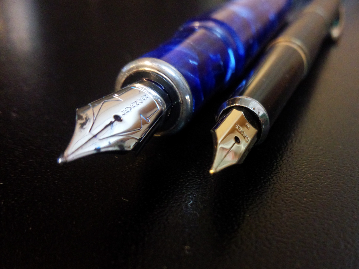
One thing I like about the Mitsukoshi pen festival–and it is my favorite of the two–is that many of the manufacturers, especially Pilot, Platinum, Nakaya, Eboya and Pelikan have sample pens for  you to try. In the past, though, they’ve also had two tables of samples, complete with lots of notepads. This year, though, the tables were gone and it took me an hour to realize that they’d been moved to a single table mixed in with the counters. I’d thought it was a pen manufacturer and had passed it a couple times.

Eventually, I sat down and started testing different pens, but the table also featured a woman whose job, it seemed, was talk incessantly to the man sitting next to me. I’m still not certain if I crashed an appointment or not, but at that point I was in “don’t understand if it’s not convenient” mode.

(Note: this mode is a variation on “it’s easier to ask forgiveness than permission” but in this case it’s easier to pretend you don’t understand what’s being said and just keep doing what you’re doing.)

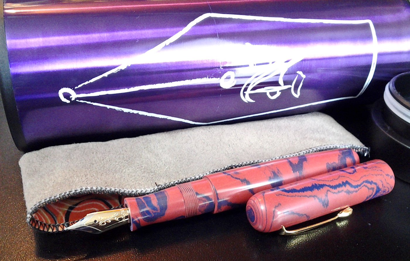
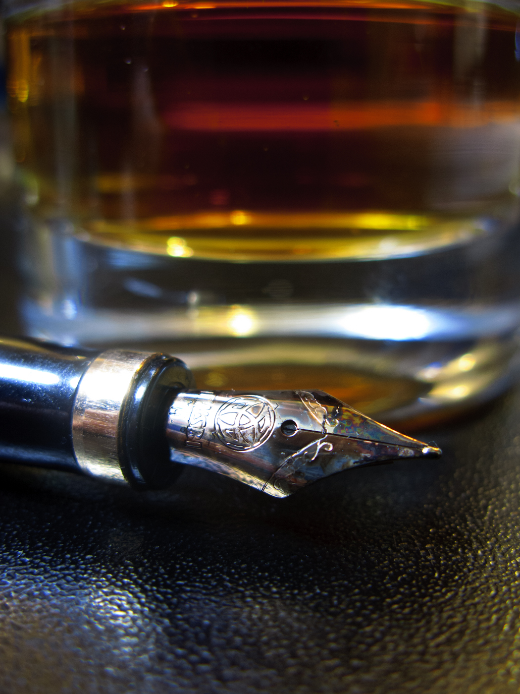
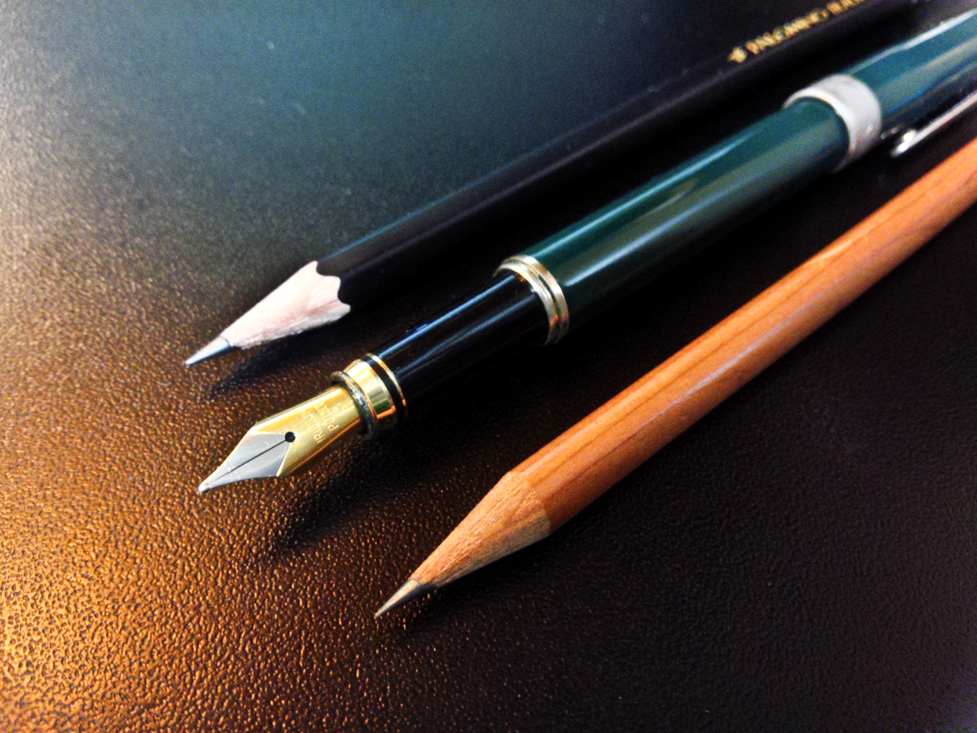
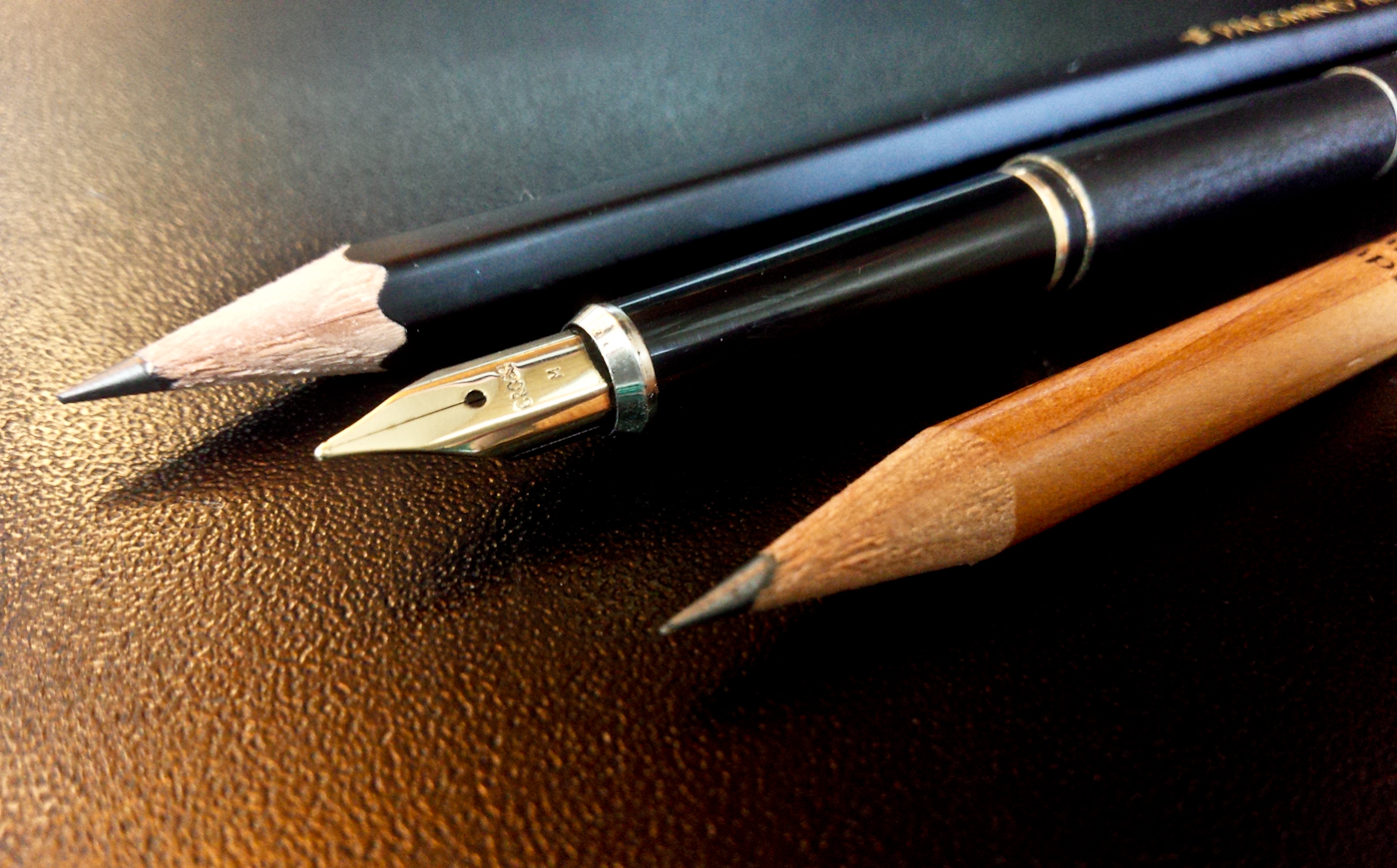
Whilst checking out the Aurora table and the Optima’s and 88s, I saw a bottle of Aurora Blue-Black ink. It quickly became mine. (Later I came back and actually tried the pens.)

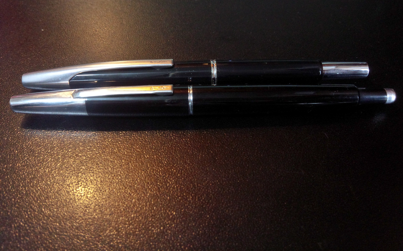
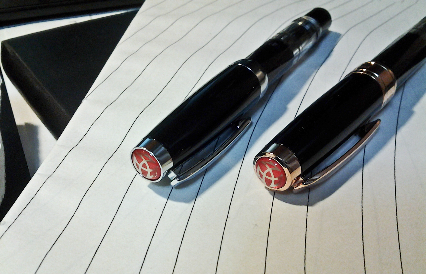
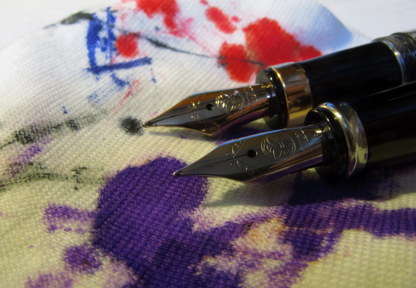
The only thing I bought:

Pilot had a special event where a handwriting expert (at least I assume that’s what he was) asked you to write with a pen that was wired to the board on which you were writing and that was connected to a computer. This action produced a computer read out of how you write, including the writing angle, which helped him choose a Pilot nib for you.

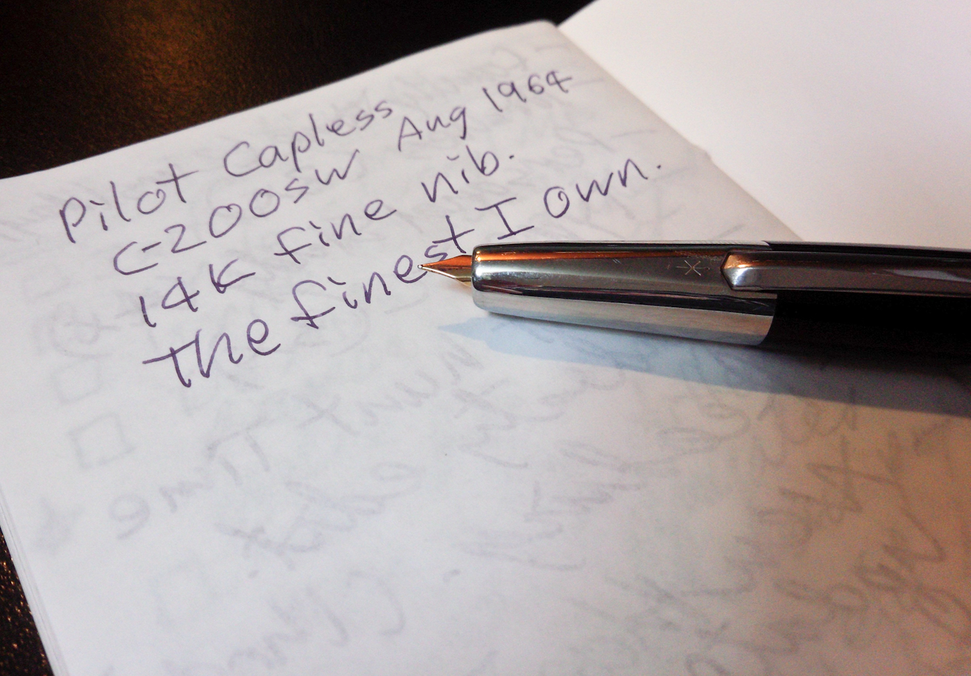
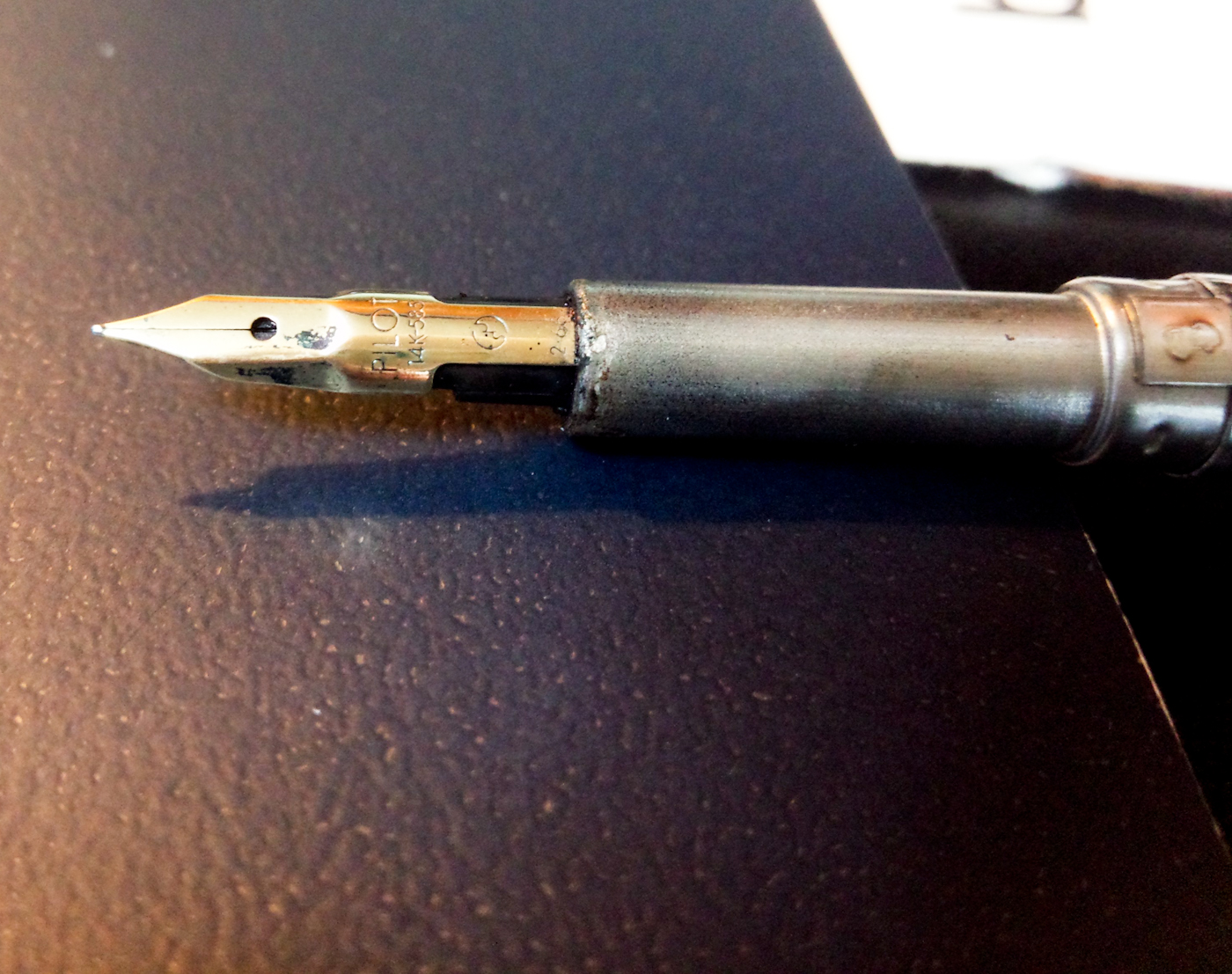
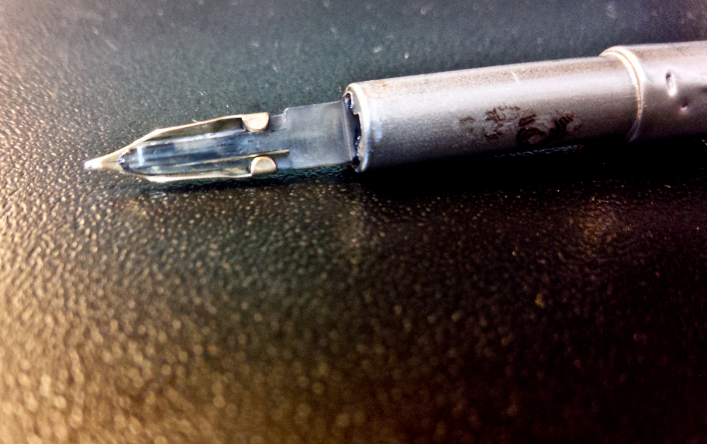
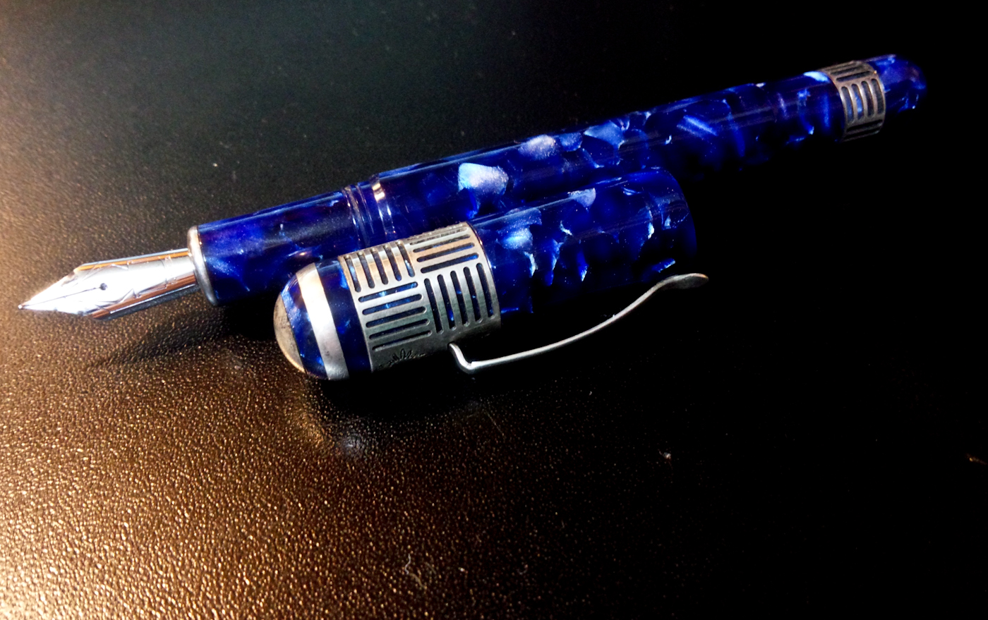
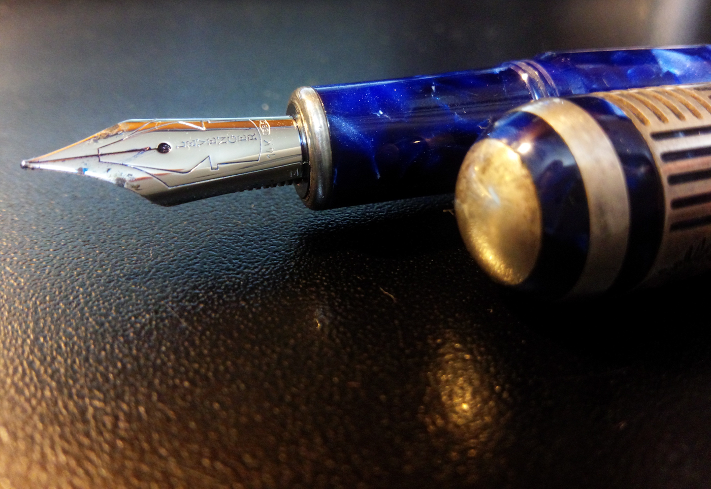
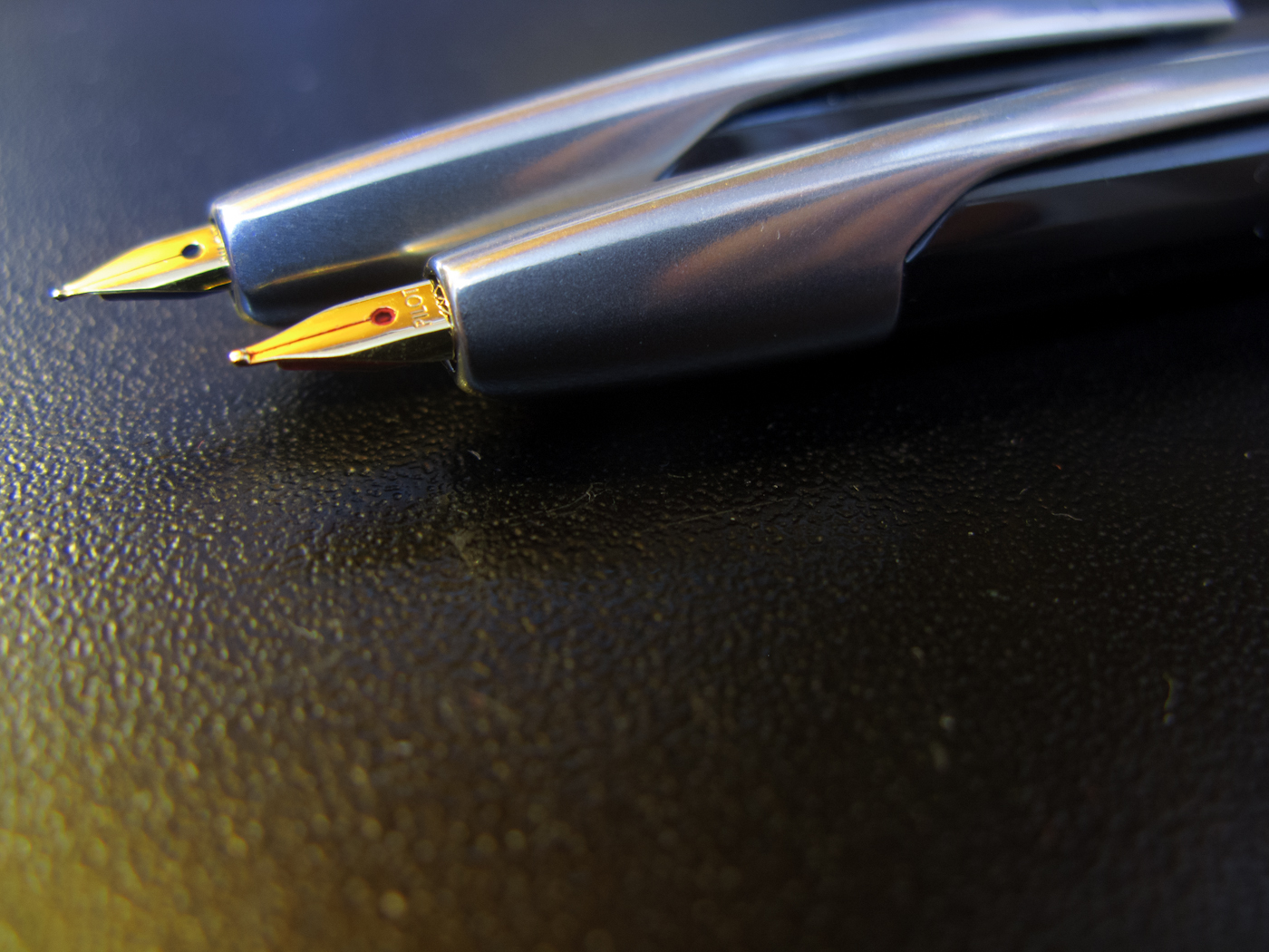
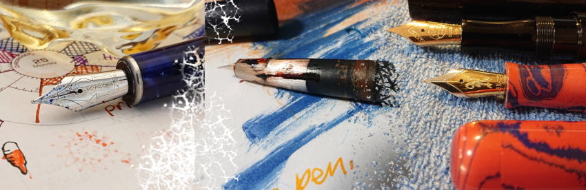
Finally, at 3:00, a Sailor counter person took pity on me and sent me to the Sailor repair man. As I predicted, he took less than five minutes to pull the feed and straighten the nib. I could have done all this myself, but as I hope to sell the pen, I thought it best to let an expert handle it.

After my pen was fixed, I exited as quickly as I could. If it hadn’t been for the noise, I’d have probably enjoyed it more. Well, except for the three hour wait. I doubt I could have handled that better.

Shawn Newton Moody Custom Fountain Pen–Long Term Review

Note: Shawn Newton sponsors a terrific scholarship program that comes with postcards and a chance to win a free pen.

Part of the problem of reviewing things you own is that you have to look back and remember prices. This can dredge up any buyer’s remorse that has long been suppressed. This is especially true when you’re reviewing a custom pen and begin second-guessing your choices.

Luckily the Moody I purchased from pen maker Shawn Newton has been worth every penny, including the cost of shipping.

I ordered the Moody right after Newton became a full time pen maker. I like ordering things from new makers and then ordering something new a few years later to see how the maker has improved and/or changed.

The ordering process involved searching the photographs on his website and selecting the basic design, materials and nib material. After that we worked out details like actual size, width, and nib grind.

I chose a largish version of Newton’s Moody design which is a cigar shape with a long section. I chose red and blue swirl ebonite (more on that in a minute) and a gold nib (which contributed substantially to the price). Although Newton offers custom grinds, I chose a basic M nib with basic tuning.

The pen arrived in a handmade pen “kimono” tucked inside what was, at the time, Newton’s new “pen coffin”: a thermal cup with the Newton logo stenciled on the side. This was a nice touch as pen coffins/boxes often end up as trash or as useless drawer filler. Mine is now in use at the school where I work. It’s the pen kimono that I don’t use.

The Moody and everything that arrived with it.

The Moody and everything that arrived with it. (Note: Newton has changed his logo since this picture was taken.)

I was a bit surprised at the pen’s color. Based on photos of the material I had chosen, I’d expected something more blue with swirls of red, but ended up with something more pink with swirls of blue. The blue, however, made terrific blue patterns on both ends that are better than a maker’s logo. Over time the ebonite (hard rubber) has begun to darken to a more coral red/pink.

Capped the pen is 5 11/16” (14.45 cm) long. Uncapped it is 5 1/4” (13.35 cm). It is 11mm at it’s narrowest point and the shape of the section makes it comfortable to use. It has a large drop off where the cap meets the body, but the long section pushes that back away from your hands. Although it’s a very large pen, it’s light and fits my hands well.

The Newton next to a JinHao 159, which is roughly the same size as a Montblanc 149.

The Newton Moody next to a JinHao 159, which is roughly the same size as a Montblanc 149.

Both pens uncapped. The Moody has a better section and is much more comfortable to use.

Both pens uncapped. The Moody has a better section and is much more comfortable to use. You can see how the pen has darkened by noticing the places on the section where it hasn’t.

The main fit and finish issues are mostly my fault. Because I chose a version with a clip, Newton had to do some extra work on the end and the only real flaw in his work is some uneven grinding around the end cap that houses the clip. It’s not bad, and Newton does an excellent job of matching the pattern, but there’s an obvious seam and I can feel where it wasn’t ground evenly on one side. I wish I had gotten a clipless version or had chosen a silver clip.

The clip and the seam. If you look closely, you can see it's uneven.

The clip and the seam. If you look closely, you can see it’s uneven.

Also, because I requested that I be able to use the pen as an eyedropper rather than with just a cartridge or converter, the threads connecting the ink chamber and the section take quite a lot of twisting to open.

However, these are minor complaints and mostly the consequences of my decisions and subsequent changes in taste. Every fellow pen addict who’s handled it has commented on how much they like the color and how comfortable it feels in the hand. One even based his own custom design on mine.

The gold M nib is extremely well tuned and the pen quickly became part of my daily rotation. Although it’s the most expensive pen I own, I’m not afraid to carry it around in my pocket. This is partly because the ebonite gets better the more it is used.

Now I’m thinking about what my next Newton pen will look like. Luckily, it will have to wait a while so I have lots of time to think about it.


Some Things are Classic, Some Things are Just Old, Some Old Things Are Classic

I went to Tokyo this afternoon to get nib work on two of my new pens. I ended up leaving with a pen that’s older than I am.

Although I like my Namisu Nexus Minimal fountain pens, both pens had nib issues. The Titanium nib was off center and the tines were misaligned. The steel nib was dry. I could have realigned the tines myself, but I had part of the day off and it was a good chance to get out of Dodge for a while.

I decided to go to EuroBox (link in Japanese) which is a small vintage pen shop right at the end of the Ginza shopping district in downtown Tokyo. It is in one of the old creepy buildings I like a lot. The stair case to the 4th floor (3rd floor UK) is hard to find and it’s narrow, low and creepy. If you go up the main staircase, you won’t find EuroBox, just a dark hallway with lots of suspicious empty rooms. EuroBox, when you find it, is surrounded by peeled paint and exposed electrical boxes.

The door to Euro-Box. Come visit us, Dwayne. Come visit us forever and ever and ever...

The door to EuroBox. Come visit us, Dwayne. Come visit us forever and ever and ever…

When I arrived, the proprietor, Eizo Fujii was helping a customer. This gave me time to peruse the displays of vintage pens. (I didn’t take any pictures as there’s a sign asking you not to. Because he was busy, i didn’t get a chance to ask him for permission. You’ll just have to visit yourself.)

As I was looking, he returned a tray of pens to the display and I noticed they were vintage Pilot Capless pens. My ears went up and I took a look at a black one expecting the price to be absurd. When it wasn’t–it’s actually cheaper than a new Pilot Vanishing Point–I started the pen buyer’s rationalization process: I expected that to be a lot more expensive than that therefore, at that price, that’s like getting a discount on it. That’s totally a bargain! I’ll take that but only because I’m saving money on that.

(Note: by that logic, almost anything, even a private jet with gold toilet fixtures, can be considered a bargain.)

When it was my turn, Mr. Fujii, who speaks very good English, fixed my Nexus pens as I watched. After he finished I asked to try to the Pilot Capless C200SW (manufactured August 1964 I believe). Unfortunately, I liked it enough I decided to buy it.

I then had to go down to Ito-Ya, one of the best stationers in Japan, to get a converter that fit the pen. (The cartridges it takes are no longer made.) After I got the pen home I had to soak it to clean out quite a bit of gunk, but now it works fine.

The initial impressions are good: It is slender but unlike other Capless pens, the clip helps you rather than gets in your way. I suspect lefties would have little trouble using this pen, which is not always true of vanishing point pens. It’s also a touch longer than my similar Vanishing Points.

The 1964 Capless compared with my mid-90's Vanishing Point.

The 1964 Capless compared with my mid-90’s Vanishing Point.

The nock mechanism is odd. You have to push it half way to extend the nib, then push it the rest of the way to release it. If you just push it all the way it doesn’t stay open and Mr. Fujii looks at you in a sad way as if you are an idiot (well, maybe that’s just me.) It has a Fine nib which I usually don’t like but Mr. Fujii smoothed it perfectly.

The pen with the nib extended and a brief writing sample.

The pen with the nib extended and a brief writing sample explaining some of the pen’s details.

The nib section, pre-cleaning. I like the odd facets on the nib.

The nib section, pre-cleaning. I like the odd facets on the nib.

The underside of the nib. You can see the surprisingly cool clear feed.

The underside of the nib. You can see the surprisingly cool clear feed.

I’ll put it in my pen rotation and do a long term review another day. Until then, there was a pink one She Who Must Be Obeyed might like. And a red and gold one other people might like. At that price they are real bargains…


TWSBI Diamond Fountain Pens–The New Workhorse

I bought some pens from Taiwan that were designed with advice from all over the world. One of them fell apart almost immediately.

I’ve written before about how I’ve used Pilot Vanishing Point pens for decades. Last year, however, at the suggestion of some fellow pen addicts, I decided to try pens from TWSBI.

TWSBI is a Taiwan based company that used to produce OEM pens but then decided to design their own. To do so, they gathered suggestions from fountain pen forums (yes they exist) and then gave the forum members chances to comment on designs. (In fact, fans of their Facebook page still get a chance to comment on possible future designs.)

The results were a series of demonstrator (see-through) pens with piston filling mechanisms. (You twist the end to draw up ink and don’t have to mess with cartridges or converters.)

I ordered two: The TWSBI Diamond 580 Black Rose Gold and the TWSBI Diamond Mini Classic.

The TWSBI Mini (left) and the 580 (right).

The TWSBI Mini (left) and the 580 (right).

The 580 is a nice sized pen and because of its smooth writing M nib, it quickly replaced the Vanishing Point as my everyday workhorse pen. (It even appears on this blog along with the Vanishing Point.) Although I miss the nock mechanism on the VPs, and the ability to operate a fountain pen one-handed, I like the ink capacity of the 580. I was worried I wouldn’t like the Rose Gold, but once I had it in hand, I immediately liked the copper look of it.

Also, TWSBI includes tools that allow the user to disassemble and clean the pen. I haven’t done that yet, but I have had to replace the cap and the nib assembly on the Mini. (And the nib, but that’s not TWSBI’s fault.)

The Mini is designed for pocket carry. It is small, but the cap posts making it much longer and much easier to use. I also got it with an M nib and even though it’s smaller, I like the ink capacity.

The only thing I didn’t like was the cap. I noticed out of the box that the clip on the Mini moved side to side. I though it was simply too flexible but over time I realized that cap was cracked. Eventually it cracked all the way around the entire finial fell off.

You can see the damage. This is a but not a feature.

You can see the damage. This is a bug not a feature.

I also noticed, after a couple rounds of inked fingers, that the MIni leaked ink. Careful inspection with a loupe revealed that the end of the nib assembly was cracked. I contacted TWSBI and without any proof–although I did offer some–they sent me a new cap and a new nib feed.

Unfortunately when I was reinserting the nib and feed, I didn’t set the nib correctly and when I put the new cap on I felt the nib go crunch and ended up with a nice hook nib. I ordered a new nib from a local vender, installed it correctly, and now the pen works perfectly.

The 580 nib (top) and the Mini nib (minus the hook).

The 580 nib (top) and the Mini nib (minus the hook).

Despite these issues, and stories of cracked plastic from other users, I recommend TWSBI pens for those looking to try a fountain pen for the first time and for those who’ve been playing with cheaper mass-market fountain pens and are ready to move up in quality. The customer service alone is worth the price and the risk. Also, if there are a series of common complaints, TWSBI usually redesigns the pen to fix the problem.

I’m not as big a fan of the Mini as I am of the 580. The Mini’s grip section is a bit too short and something about the balance with the cap posted doesn’t feel right. I am tempted to sell it and get a second 580 (either clear or orange).

A dirty pen and whiskey in a dirty glass. Bad ideas ahead.

A dirty pen and whiskey in a dirty glass. Bad ideas ahead.


Levenger Sunset Fountain Pen By Stipula

It’s really depressing when you open a purchase and your first thought is “How the hell am I going to get this fixed?”

This happened to me when I bought a pen from online retailer Levenger. The pen was the Levenger “Sunset” made by Italian pen maker Stipula. It had sterling silver decorations on top of blue cracked ice acrylic and that made it look vaguely like R2-D2. I liked the look and I liked the Italian pedigree and liked that it was priced to sell after a huge price drop.

This is not R2-D2 and that's a sunburst logo not a sunset.

This is not R2-D2 and that’s a sunburst logo not a sunset.

When I got it the first thing I noticed was the silver was tarnished. I emailed Levenger and their reaction was “Yeah, how about that.” In their defense, it wasn’t worth anyone’s effort or money to ship back to the USA for polishing and then have it shipped back to Japan.

I was also surprised that the word “Stipula” appeared nowhere on the pen. It only says “Made in Italy” under the Levenger Sunset inscription on the barrel to prove it wasn’t made by Levenger’s normal manufacturer.

I started using it and immediately liked the larger size. It’s 11.7 millimeters (just under half an inch) at the grip section and unposted it’s 5.4 inches (137 mm) long. Posted it’s an absurd 6.5 inches (166 mm). With the cap posted it’s too long to use comfortably.

The pen and cap. I like that cracked ice acrylic a lot.

The pen and cap. I like that cracked ice acrylic. The photos, unfortunately, don’t do it full justice.

A size comparison with my Cross Century.

A size comparison with my Cross Century. Note the scuff marks on the shoulders of the nib.

As I started using it I noticed that although it was a smooth writer–it’s a Rhodium plated 14 carat gold nib–it had an annoying problem. As I wrote, one of the tines would click out of place and I’d have to hold the pen slightly sideways to get an even ink flow. If I turned the pen over and pushed lightly I could hear the tine click back into place.

This became annoying enough that I finally put it way for a few years until last year when I sent it off to Mike Masuyama for work. He fixed the tines and smoothed the nib and it’s now one of my favorite pens. Despite its size it’s light and a pleasure to write with. It currently has Aurora blue ink in it which makes it even smoother.

The only remaining annoyance is caused by the silver plating. To accommodate the silver pattern and the sunburst (it’s not a sunset) on the cap, the clip had to be moved down the cap and this means the slot for the nib is small. Also, there’s a lot of metal inside there and it has to be cleaned frequently or it starts to corrode. Over time I’ve scratched the shoulders on the nib. It doesn’t hurt the writing experience, but I also have to be careful that everything’s centered when I put the cap back on or I risk mangling the nib.

That said, I’m pleased that after several years the pen finally became a purchase worth getting and something worth keeping.

The nib and cap. You can see the Levenger logo and the scuffs on the nib shoulders.

The nib and cap. You can see the Levenger logo and the scuffs on the nib shoulders.

Retro 51 200 Series Fountain Pen–Twenty-One Year Review

I bought a pen in 1994 that I wouldn’t like very much until 2014.

Soon after I moved to Oxford, Mississippi to work on my Ph.D., an acquaintance of mine opened a shop that was way ahead of its time (i.e. doomed to fail) and featured items that wouldn’t be trendy for another ten to fifteen years.

I helped out by buying a dark green Retro 51 fountain pen. I liked the look and liked that it was heavier than my old Cross Century. The grip section wasn’t much thicker, but the barrel was and the extra weight made it much more comfortable to hold.

It turned out I didn’t like much else about the pen, though. The wood pen coffin it came in was cool, but it didn’t lock closed. If I grabbed the coffin incorrectly, I dumped the pen on the desk. I also didn’t like that it couldn’t hold two small standard international ink cartridges. (One installed, one backwards in reserve.)

Also, although the cap was apparently designed to be posted, it had to be pushed on hard to get it to stay. The cap flipped off several times when I was writing. Without the cap it was too small to use comfortably.

I could have forgiven that, though, if the nib had been better. I always found the steel M nib scratchy and dry. After several months of use and attempting to like it, I ended up switching back to my Cross Century (until I discovered the Pilot Vanishing Point).

Also, almost as soon as I started using it regularly, it got chips in the enamel paint, exposing the brass underneath. Even worse, the gold plating on the clip and the band started wearing off.

I stored the Retro 51 and almost literally let it rot as I didn’t bother cleaning it much before putting it in storage.


Here you can see the corrosion and the size.

Here you can see the size and the corrosion from all the years of neglect.

Detail of the lost gilding and the Retro 51 Logo.

Detail of the lost gilding and the Retro 51 Logo. This all used to be shiny.

Me being me, I took it out of storage after 10 years or so and tried to use it. Me being me, I dropped it and left it with a nice hook style nib. Me being me I put it back in storage until I heard via the Pen Addict of a nibmeister named Mike Masuyama. Because I had another fountain pen/questionable purchase that needed nib work, I decided to send the Retro 51 along for repair. (More on the other pen in another post.)

Mike Masuyama did a great job on both pens and the Retro 51, after twenty years, finally entered my regular pen rotation.

Now, however, the pen is going back in storage. It’s too small to use for a long time and I have other pens I like better. I’m still annoyed it won’t carry two cartridges and that it won’t accept standard sized converters.

I may still have the annoying wood coffin, but I have no idea where it is. That’s also me being me.

A wider size comparison.

A wider size comparison showing the cap posted.


Cross Century “Classic” Fountain Pen Long Term Review

I used to claim, back when I was in school, that I’d never thrown out a pen. This was not because of hoarding tendencies, but because I would always lose them long before they’d run out of ink.

Then, sometime in the early 80’s, my father got a pen and pencil set from Cross that included a fountain pen he didn’t want and he passed it to me. The first hit was free and I was immediately hooked. I kept that pen longer than any other pen I’d ever owned and actually used.

Eventually, of course, I lost it but somehow (student loans) managed to replace it guaranteeing that my student loans were spent on at least one thing that was useful.

The first hit was free.

My oldest fountain pen and maybe the only useful thing purchased with my student loans.

I used the Cross Century all through college and graduate school and am still impressed by how neat my notes were when I used it. It also survived two years in Albania with the Peace Corps.

I was partial to blue-black ink although I tended to cycle from blue to blue-black to black to blue quite regularly. It has a gold plated steel medium nib that was always very smooth and the black matte coating on the barrel looked cool–I’ve never been a fan of the gold and silver versions–and kept it from getting too many finger prints.

I used it until I bought a Retro 51 200 series and then used it some more when I didn’t like the Retro 51 as much as I thought I would. I didn’t replace it until I moved on to harder stuff: Pilot Vanishing Points. Even after that, I used it a bit, but eventually it got tucked away in a box.

A couple years ago, out of nostalgia, I broke out the Cross Century, cleaned it and re-inked it. I immediately began to wonder what I saw in it. It is surprisingly thin, much thinner than I remembered. In fact, it’s about the same thickness as most woodcase pencils. After several attempts to writing something longer than a signature, I cleaned it and returned it to the case.

The Cross Century next to a Levenger and a Palomino Blackwing.

The Cross Century next to a Levenger pencil and a Palomino Blackwing.

Now, after almost 30 years, I’m thinking about getting rid of it. I don’t see myself ever using it again and there’s no point in keeping it if it’s just going to stay in a box.

I’ll either sell it or pass it on to one of my daughters and see if I can get her hooked.


Pilot/Namiki Vanishing Point “Faceted Version” Long-Term Review

It took me 20 years to write today’s review.

I don’t remember which one I got first, but I think it was the Pilot. I seem to remember getting it back when I was at graduate school at Ole Miss in 1995. I got the Namiki right after I moved to Japan in 1996. The latter came in a fancy pen coffin with enough room for three pens. Me being me, I got them both in basic black, although I wish I’d thought to get a different color.

The Namiki and the Pilot. Only the names have changed.

The Namiki and the Pilot in the coffin. Only the names have changed.

In the end, though, it doesn’t matter what order I got them, because they’re both basically the same pen with the same strengths and structural weaknesses.

As I’ve written before, my fountain pen history moved from a Cross Century to a GoldenStar 711 to a Retro 51 200 series before a friend introduced me to the Vanishing Point.

VPs are rather strange at first. The built-in clip takes some getting used to, but I found the “facted version” of the pen to be thin and light enough that I didn’t have any problem adjusting to it. I’ve used both pens enough that I’ve worn slight dents in the clips l where my index finger rested.

Oddly, when I switched back to regular fountain pens I found myself rolling the pen in ways I couldn’t with the VP. One advantage of the built-in clip is you always hold your pen correctly, at least if you are right-handed.

There’s also a charm to being able to click the pen into use rather than fiddling with a twist cap and posting and hoping you don’t lose the cap and then fiddling with the cap again and then doing it all over when you realize that in all the fiddling you forgot to write something down.

The VP nibs are terrific. I prefer the thicker Medium–that nib and Pilot Blue/Black ink is still one of my favorite pen and ink combinations–but had very few complaints about the Fine except the way it got scratchy on cheap paper. I otherwise never had any problems with them, even though I used them for almost 20 years and tended to flush them infrequently (once every five years or so, give or take).

The only complaint I’ve had in those 20 years was structural. The barrels on both pens–specifically the part with the “nock”–cracked over time. I suspect that it was partly a combination of over-tightening, being tossed in bags and occasional, sudden flights to the floor. It’s also partly the result of questionable design as the “female” threads are cut directly in the plastic and there’s no metal ring reinforcing them even though they are tightening over metal “male” threads on the pen body. (That sentence didn’t seem dirty until I wrote it.)

Several years ago, during a trip to one of the Tokyo pen shows, I asked the Pilot booth if it was possible to repair the pens. They referred me to the pen section of the store where the show was taking place. The clerk took both pens and sent them off to Pilot Pens which managed to find a replacement barrel for one. The other remains cracked and retired and I’ve always claimed I got the last replacement barrel in Japan. (It seems they were only out of black, though. I could have got another color.)

Eventually I replaced the “faceted versions” with a modern VP made of metal. I like the new style, and will review it some day, but nothing beats the sleek look of the “faceted” VPs. They are works of art.

Still good looking, even after 19 of use.

Still sleek and good looking, even after 20 years of use.