Tag Archives: notebooks

Spiral Bound Bits of Hell

After using them for a large portion of my education, I finally reached the conclusion that I hate spiral bound notebooks in all their various forms.

I only bring this up because at last year’s ISOT I was given a spiral notebook as a free sample from a Korean notebook manufacturer. I frowned inside at it, and since I have no poker face whatsoever that means I frowned outside at it too, but I accepted it because it was free and I was interested in the smartphone app that accompanied it. (As used notebooks pile up around me in the variety room/office, digitizing my scrawls and scraps has become increasingly important to me.) I put off testing it but feel that since it was given for evaluation it’s only fair that I evaluate it.

I’ll get to that review in another post. Today, though, I want to trash the binding. As I’ve used the notebook, I’ve begun to remember the reasons I stopped using spiral bound notebooks. (Note: I count anything bound with continuous metal rings as “spiral bound”.)

–The binding is thicker than the notebook which means the binding inevitably gets mashed and mangled if it’s carried in a bag.

–The binding is thicker than the notebook making them impossible to stack.

–If you do stack them, they wire binding gets stuck together.

–They only work well on one side but your hand rests on the binding when you’re using the other side which makes them uncomfortable to use.

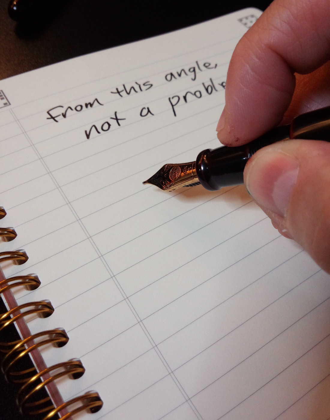
Since I’m right handed, this is the only side of the spiral bound notebook that works for me.

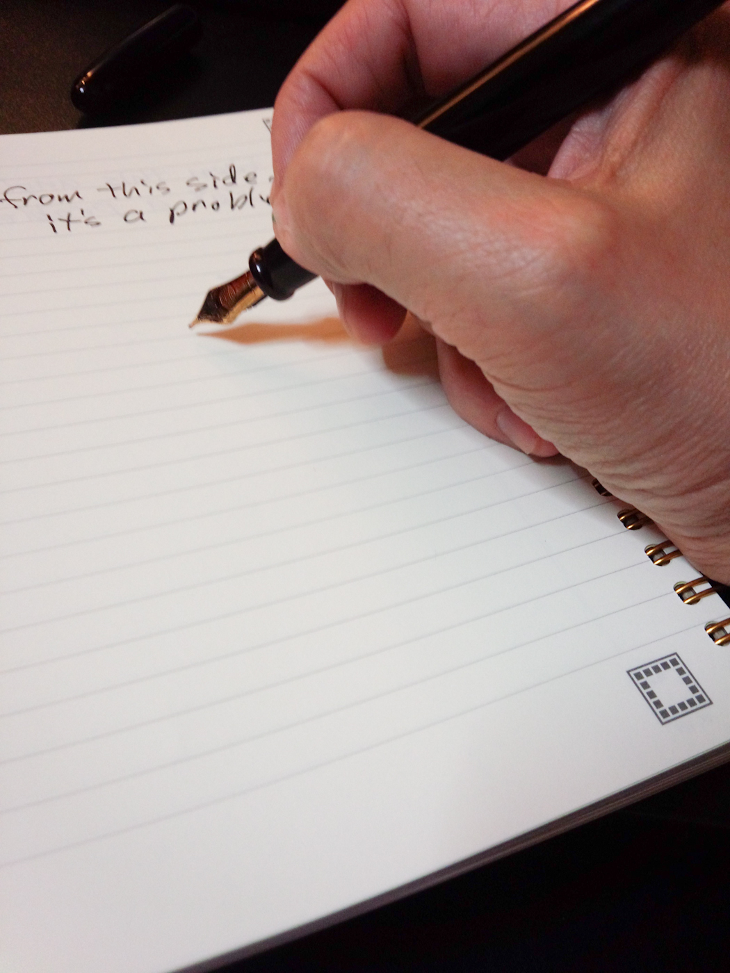
This side sucks and leaves marks.

–When you tear pages out you get the fuzzy bits that seem to get all over everything.

–When you tear pages out there’s always a piece of fuzzy bit that gets stuck in the binding.

I remember professors insisting that we cut off the fuzzy bits before we turned in assignments. The fuzzy bits were only slightly less hated than the dreaded slippery plastic cover.

I’m more forgiving of top-bound notebooks like the Nock Co. DotDash Spiral Pad or the Field Notes Byline, especially as the Byline attempts to protect the binding, but they are still problematic.

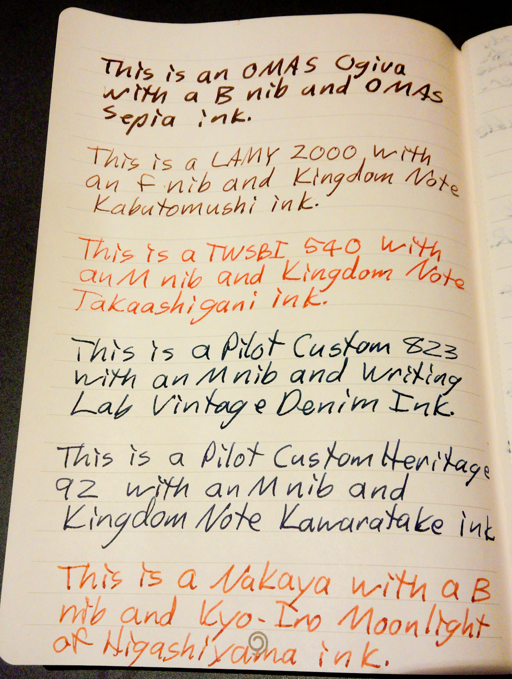
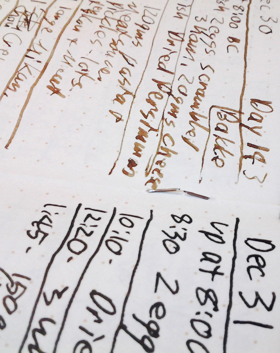
I dug through some old writing journals and found an old spiral notebook I saved for some reason, probably the contents (more on those in a future post). The spiral is getting grungy and probably about to rust.

It may be time to digitize the contents and rid myself of the last remnants of spiral bound in the house. Well, at least once I finish the review of the one I got from Korea.


Victoria’s Journals’ TeaBook–End of Book Review

Disclosure: I got the Victoria’s Journals’ TeaBook at the 2016 ISOT as a sample from the notebook maker himself. I told him I’d use it and abuse and write a review only if I thought it was worth buying. It turns out it is.

The maker of the TeaBook is a fountain pen addict and designed the notebook to hold up well to fountain pens. He did a good job.

In general, the paper held up quite well against the brutal fountain pen onslaught I inflicted on it.

The TeaBook is an almost A5 sized notebook (it’s a few millimeters thinner but is the same height). It is designed to be rolled up and carried in clothes pockets or even in the bottle holder on a carry bag.

The TeaBook rolled up tightly.

It comes rolled up in a tube that reminds me of the tubes that Retro51 pens come in. The notebook can be rolled up quite tightly, but then lays flat without any latent curl. The cover is a flexible red plastic that didn’t crease over time.

The TeaBook in front of its case.

The pages are made of 80# Spanish paper. The version I had was lined, but it appears to come in at least dot grid as well. (Note: I had a prototype case that didn’t match the paper I had inside so this is just a guess.) Each page is perforated, which is something I usually don’t like, but after a few months of regular use, none of the pages had started to work loose. I did, by the end of the book, like the idea of being able to rip out pages I wanted to use and then get rid of the rest.

Detail of the perforations and the lines. I liked the light ruling.

The paper handled fountain pens about as well as the Field Notes America The Beautiful edition. Several inks bled through, though, including one that destroys laughs at notebook paper and snickers at Tomoe River paper—No, really, it mocks the paper it’s used on—and that was while it was in a pen with a steel M nib. (More on that ink in a future post.)

My ink testing page.

The results of the ink tests. The results are respectable, given most of the nibs and inks were terminators, but not great. I’m not sure this facing page was necessary, though, so I didn’t mind defacing it.

My only complaints with the TeaBook were minor and more a matter of personal preference. I’m not a big fan of title pages on notebooks, and even less of a fan of personal information sections. I’m not going to leave my address around in case some radical pen/notebook addict finds my notebook and then tracks me down to punish me for disrespecting stationery. (Oh, sure, mock me as if I’m the only person who does that.)

This really isn’t necessary and could lead to me visiting your house.

Also, I’m not sure it needs the logo, as cool as it is, taking up space on each page.

Lastly, some kind of built in strap or aftermarket binder loop to keep the notebook closed tight would be nice because it tends to unroll to fit the space it’s put in. That said, it’s probably easy to make or rig up something like that.

Right now the TeaBook, if it is available (it may only be a prototype) is only available from retailers in Asia. Interested parties will have to contact the maker for more information.

I’ll be contacting him myself. I’d like to try a couple versions with different paper styles.


Field Notes Workshop Companion–End of Book Review

I just finished a notebook that was both friendly and unfriendly to fountain pens. I like it a lot, but it also kind of annoys me.

The Field Notes Workshop Companion Book 01 “Wood Working” is one of six notebooks in a boxed set sent as part of the Summer 2015 Field Notes Colors edition.

On paper, so to speak, it seems great. It has French Kraft-Tone 70#T “Standard White Craft” paper with a light brown dot grid pattern. 70#T paper is thick enough to handle most fountain pens and inks.

The notebook also looks great. Each book in the boxed set has a different color cover and a different “workshop” theme: wood working, automotive, gardening, painting, plumbing and electrical. Each book includes information and tips about its theme. The back of the Wood Working includes information on nail varieties, wood working jargon and the always wise “A table saw can be either your best friend or your worst enemy…”

The Workshop Companion on the right next to a used America the Beautiful edition.

The Workshop Companion (right) next to a used America the Beautiful edition.

The cover is 100#C card stock that features some excellent design work.

My back page tests showed that the paper could handle every fountain pen and ink I threw at it. Even the heartbreaker, Noodler’s Apache Sunset put down with a steel flex nib, didn’t bleed through or feather.

The pen tests. I push fairly had to leave as much ink as I can.

The pen tests. I try to lay down as much ink as I can. That’s Apache Sunset at the top and second from right at the bottom. The 1.1 stub looks great here (on the right above the red lines). 

The back side of the same page.

The back side of the same page. Even Apache Sunset with a flex nib couldn’t break it.

At this point I started to encounter my first “Hmmm” moment. My favorite Field Notes notebook, of the few I’ve used, is the America The Beautiful edition. It has Finch Paper Fine 70#T “Soft White” paper that was smooth and terrific to write on. Because both editions are 70#T, I was expecting a similar experience with the Workshop Companion.

However, the paper in the Workshop Companion notebook felt much rougher and stiffer than the paper in the America The Beautiful. As a result it was much more unforgiving with some of my pens. My Edison Glenmont’s 1.1 mm stub nib, for example, didn’t do well on the paper at all. Instead of a thick line, it tended to leave a thin line with little shading. Other pens did better, but I found the writing experience to be inconsistent and, depending on the nib, scratchy.

Also, although the middle page didn’t start falling out as in my Two Rivers edition, I could see that the staples were starting to give way even though the notebook had been carried in a cover rather than unprotected in my pocket.

The weak staple. You can also see how badly the stub nib does at the top of the picture.

The weak staple. You can also see how inconsistently the stub nib performs on the paper at the top of the picture.

I like the Workshop Companion a lot and it draws double takes from almost everyone who sees it. If the it had smoother paper and better staples it would be perfect. Instead, as is, it’s just very good. I’ll look forward to using the rest of the books, but I won’t rush to get more.